From BlackWhite magazine - issue 03, sensitivity feature
Conscientious choices that are easy on the senses and the planet.
In the inaugural issue of BlackWhite magazine, we took an in-depth look at Universal Design and brought attention to some of the most common details that are overlooked when undertaking new builds and retrofits. Many of the circumstances we covered dealt with the physical ways in which people interact with spaces and how that can change during the lifespan of a structure due to aging and injury. However, products and colour specifications can also impact users that may be faced with less perceptible difficulties that are frequently dismissed due to a lack of understanding or visibility.
It can be easy to forget the extent of our privileges and that not everyone shares the same experience of the world that we do. Though it may not be feasible to take every sensitivity into consideration in every project, the more knowledge you have, the better your ability to make more conscientious product and colour selections. Your awareness may even put you on the lookout for opportunities to incorporate these considerations even when they aren’t part of the brief.
Relatively undiscussed until the turn of the millennium, Volatile Organic Compounds (VOCs) have since become a hot topic – particularly in the coatings industry. In the case of paint, the term refers to solvents that are released into the air as the coating cures over time. While your clients or customers may have a general awareness that VOCs exist and that they’re something to avoid as much as possible, chances are that they will be looking to your expertise as either the person specifying the paints and finishes or the one applying them to answer their finer questions. For some, these concerns will be with respect to indoor air quality and the effect of VOCs on building occupants. Others will have queries about the impact of VOCs on the greater environment and outdoor air quality. So, we’ve endeavoured to give a brief overview on both.
One of the most frequent questions that you’ll encounter is whether or not a particular product or formula is ‘low VOC’. But given that the subjective scale and perception of what constitutes ‘low’ versus ‘high’ has evolved dramatically since the awareness of VOCs became mainstream, it helps to quantify them. Most waterborne paints now have VOC levels of 100g or less per litre. Traditional solventborne paints have considerably higher levels of VOCs than their waterborne counterparts, often 400g per litre or higher. For example, 7 litres of Resene Waterborne Woodsman has around the same VOCs as just 1 litre of solventborne Resene Woodsman.
But there are many other household sources of VOCs beyond paints, stains and decorative coatings. Hairsprays, deodorant sprays and many cleaning products also release VOCs. In early 2007, Hong Kong enacted a regulation for hairsprays that no more than 80% of their content by weight could be VOCs. This means that a 500gm can of hairspray could potentially contain 400g of VOCs. Most hairspray users go through a can every one to two months, which would equate to up to 4800gm of VOCs emitted per year. This is the same level of VOC emissions as you would get from using 87 litres of paint of a low VOC waterborne enamel, such as Resene SpaceCote Low Sheen, which would be sufficient to apply one coat to an area of around 1000 square metres.
Once a paint has fully cured, it doesn’t release any further VOCs, so 1L of Resene SpaceCote Low Sheen will emit a total of just 55g of VOCs while it cures then no more for its entire life. To put this into context, consider some other sources of VOCs. It’s estimated that the average dairy cow emits 8.75kg of VOCs a year (or 23g per day). That means that in just two days, a single cow releases nearly the same quantity of VOCs that 1L of Resene SpaceCote Low Sheen releases in 3,652 days. By comparison to our earlier example, someone using one can of hairspray per month will emit up to 48kg (or 48,000g) of VOCs in the same time period.
Resene has always believed that one of the best contributors to sustainability is to produce products that offer longevity and best protection and thus reduce the need for substrate repainting and replacement. So while reducing toxicity is the way of life at Resene, quality remains paramount. As a specifier, if you are choosing Resene products because you share in this belief that using quality materials in the first place is among the most important ways to protect our environment, then you’re already making a meaningful conscientious choice in the course of your work.
If you want to consciously specify products that will further limit the VOCs that your project emits, Resene has you covered with a wide range of Environmental Choice approved products to choose from. Resene Zylone Sheen Zero has no added VOCs while Resene Ceiling Paint and Resene Broadwall sealer are both very low VOC. But, as always, we recommend getting in touch with your local Resene representative to discuss which products will be the right fit for your project requirements.
Did you know? Resene has a full range of Resene Decorative Colourants with no added VOCs, so you can choose whatever colour you want without adding any additional VOCs.
Now that you have a better idea of the quantities of VOCs that your project may be emitting, the next step is to understand how they may affect its users. The ability of organic chemicals to cause health effects varies greatly, from those that are known to be highly toxic to others with no known health effect. As with other pollutants, the extent and nature of a health effect will depend on many factors including the level of exposure and length of time exposed. Among the immediate symptoms that some experience after exposure to some VOCs include eye and respiratory tract irritation, headaches, dizziness, visual disorders and memory impairment. But a key factor that can’t be ignored comes down to the health of those individuals who are coming into contact with these substances in the first place – especially those who are susceptible to respiratory and environmental illnesses.
According to the World Health Organization, asthma affected an estimated 262 million people in 2019. Many different factors have been linked to an increased risk of developing asthma, although it is often difficult to find a single, direct cause. But one thing that sets it apart is that it is the most common chronic disease among children, and given that it can’t be cured, asthma affects all ages and demographics.
Because it’s so common, many people understand what an asthmatic reaction is: a closing of the airways that can be triggered by many different substances or circumstances. Most people are also familiar with the way allergies work, too: someone has a reaction to their surroundings that can range from mild seasonal allergies to trees and grasses to severe anaphylaxis to peanuts. Others may even experience or know someone who has negative, physical reactions to such things as cigarette smoke, diesel fumes, solvents, bleach, strong perfumes or standing in the laundry aisle too long. The term ‘Environmental Illness’ is generally used to describe these mild to severe health responses to the environment. This could even be from food, plants, animals, smoke, smog, chemicals or even electromagnetic fields. Although many living with asthma and allergies may also react these same triggers, environmental illnesses like these do not fall under the category of allergies. The term ‘sensitivities’, on the other hand, is a medical term used to describe physical responses of the body that do not include allergies.
Sensitive Choice® is an initiative of the National Asthma Council Australia to help those with asthma and allergy sufferers make better lifestyle choices that may help them manage their condition more effectively. The programme is focused on companies that are committed to reducing asthma and allergy triggers. Products from paints and coatings through to bedlinens are formally reviewed and those that qualify are awarded the initiative’s blue butterfly symbol.
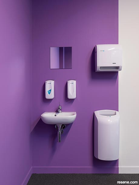
Resene Lustacryl Kitchen & Bathroom and Resene SpaceCote Low Sheen Kitchen & Bathroom are both Sensitive Choice® approved. Ideal for wet areas such as bathrooms, kitchens and laundries, these products contain anti-bacterial silver and MoulDefender to help protect against moss and mould growth.
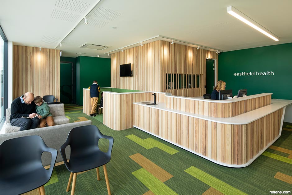
Resene Clinicalcote is also Sensitive Choice® approved. It is formulated with anti-bacterial silver and designed for easy cleanability in areas such as rest homes, hospitals and medical centres but it can also be used on general wall areas in homes, offices and businesses that need to accommodate sensitive occupants.
Top tip: Encourage your clients to experience their colours before they commit. Apply the entire contents of a Resene testpot on to an A2 card in two coats, leaving a 2cm wide unpainted border around the edges. Once dry, have your client roll each sample into a loose tube and look down on to the bottom inside to gain a better understanding of how it will feel when they are surrounded by the colour. If the space is already constructed, have them view this larger swatch of colour in the space itself. Ask them how it makes them feel and use this to guide the colour options.
Did you know? Resene removed lead from its decorative paints in the late 1960s, well ahead of other manufacturers and long before it was banned by New Zealand legislation in 1979.
Because people often don’t realise that their experience of the world is different from others, it can be common for those with certain conditions to be unaware that they are suffering unnecessarily and that they could be helped with carefully considered colour choices. Sometimes people instinctively choose colours for decoration or writing on that they find soothing and comfortable, a behaviour that can be an indication of sensitivity in and of itself.
Irlen Syndrome can cause a range of difficulties with sensitivity to light – especially fluorescent ones – as well as certain colours and patterns. Most common are difficulties with whiteboards, overhead projectors, bright shiny surfaces and high contrast circumstances (especially black print on white paper, but also brightly coloured or busy patterns such as stripes, polka dots, swirls on clothes, displays, wallpaper and flooring). Common symptoms can be treated with precision tinted glasses or contact lenses to reduce discomfort, but may not eliminate them.
There are a wide range of other ‘invisible’ conditions that can cause sensitivity to light and glare, from cataracts to macular degeneration, corneal damage or head injuries like concussions. And since the existence of colour depends upon the existence of light, a sensitivity to one can translate to a sensitivity to the other. People with photosensitive or reflex epilepsy can have seizures triggered by certain colours and/or repetitive patterns. While many are aware of the existence of this condition, it is often both ‘invisible’ and misunderstood.
Synesthesia, on the other hand, is something most people are far less familiar with. A nonpathological phenomenon where stimulation of one sense automatically provokes a secondary perception in another, synesthesia is thought to affect between 2-4% of the population – though the way in which it manifests varies from person to person. When some experience sounds, music or voices, they also see them as colours. For the majority of synesthetes, numbers and letters have colours. For others, colours may have their own smells or tastes. For someone who has never experienced synesthesia, this information may be especially difficult to understand or imagine. But it’s perhaps the most illustrative example of just how different other people’s interactions with their surroundings can be.
As humans, we are programmed to react to our surroundings. The environmental cues that we pick up through our senses cause physiological responses within the mind and body which are critical to how we perceive the world. In general, neurotypical individuals integrate this data easily which helps them comprehend what is happening in the physical space and how they should react to it. However, the needs of those who are neuro-atypical or neurodiverse are often underacknowledged.
Everyone can recall how a smell might evoke a memory, loud music may make you feel anxious or irritated or a colour might make you feel more energetic. But for someone with Autism Spectrum Disorder (ASD), this response is amplified many times over. Estimates from the NZ Ministry of Health suggest that approximately 1 in 100 New Zealanders have ASD. On top of that, there are countless others who suffer from Sensory Processing Disorder, anxiety and stress, Obsessive Compulsive Disorder or who have intellectual disabilities and other special needs that also fall into neurodivergent categories.
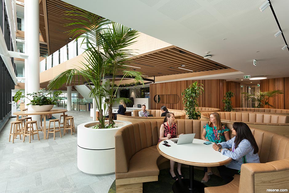
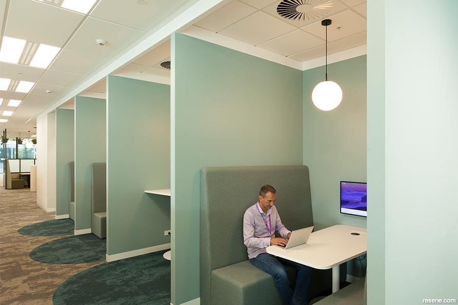
People who are neurodiverse may be influenced far more by their surroundings than neurotypicals, and this can sometimes be a catalyst for difficult behaviours. But visually sensitive individuals can feel the impact of environmental stimuli far more than most, meaning the colours we design with have the ability to really make a difference in their lives. Luckily, spaces that are designed to embrace various sensory needs are often more enjoyable for everyone and can make it easier to concentrate and stay alert, improve coordination, create a sense of security and ultimately lead to better mental health.
Top tip: Those with ASD may have a lower threshold when it comes to environmental stimuli, including light, so it can be helpful to reduce glare by choosing a low sheen paint formula for walls such as Resene SpaceCote Low Sheen waterborne enamel in soft, warm neutral hues such as Resene Rice Cake, Resene Half Cloud or Resene Quarter Bison Hide.
There is no one-size-fits-all colour choice that is sympathetic to all sensitivities, but there are definitely colours that studies have shown to be visually recessive, less stimulating and more conducive to creating a restful and relaxing environment – particularly, dusted blues, greens and off-whites. Some of the most popular serene selections include Resene Duck Egg Blue, Resene Ashanti, Resene Haven, Resene Half Truffle and Resene Half Surrender.
Learning more about the properties of colour, especially things like intensity and light reflectance value, can improve your ability to make more suitable colour recommendations that better support your clients’ needs – as can expanding your knowledge of colour theory and furthering your learning about the effect that different sheen levels and finishes can have on paint colours.
But helping your clients to experience colours before they commit to them is also key. Ordering professional tools like A4 drawdown swatches and encouraging trial through Resene testpots will allow your clients to have a greater understanding of how a colour will impact them when used on a larger scale far better than a small paint chip. And a client who is confident with the colours you’ve agreed on before a paintbrush ever reaches the wall is far likelier to be a happy client at project completion.
Top tip: Drawdowns are A4 screen-printed Resene colour samples useful for evaluating colour at a larger scale. Order them through your local Resene ColorShop, Resene representative or online.
Often products that are easy on the senses are easy on the environment, too. Resene has an extensive range of Environmental Choice approved paints that have been independently verified, including products with no added VOCs and an extensive range of low VOC products.
Choosing the right product is only part of the decision – the impact is also in the application. Resene Eco.Decorators are a nationwide network of environmentally responsible, quality focused painting contractors who provide a quality finish achieved in a sustainably minded way. Once the decorating is done, unwanted paint and paint packaging can be returned to the Resene PaintWise recycling and product stewardship programme (NZ) or to Paintback (AU).
› For more information on Resene’s sustainability initiatives, programmes and products, visit www.resene.com/sustainability.
This is a magazine created for the industry, by the industry and with the industry – and a publication like this is only possible because of New Zealand and Australia's remarkably talented and loyal Resene specifiers and users.
If you have a project finished in Resene paints, wood stains or coatings, whether it is strikingly colourful, beautifully tonal, a haven of natural stained and clear finishes, wonderfully unique or anything in between, we'd love to see it and have the opportunity to showcase it. Submit your projects online or email editor@blackwhitemag.com. You're welcome to share as many projects as you would like, whenever it suits. We look forward to seeing what you've been busy creating.
Earn CPD reading this magazine – If you're a specifier, earn ADNZ or NZRAB CPD points by reading BlackWhite magazine. Once you've read an issue request your CPD points via the CPD portal for ADNZ (for NZ architectural designers) or NZRAB (for NZ architects).
![]() Get inspired ! Subscribe
Get inspired ! Subscribe ![]() Get saving ! Apply for a DIY card
Get saving ! Apply for a DIY card
![]()
Can't find what you're looking for? Ask us!
Company profile | Terms | Privacy policy | Quality and environmental policy | Health and safety policy
Colours shown on this website are a representation only. Please refer to the actual paint or product sample. Resene colour charts, testpots and samples are available for ordering online. See measurements/conversions for more details on how electronic colour values are achieved.
What's new | Specifiers | Painters | DIYers | Artists | Kids | Sitemap | Home | TOP ⇧


