From BlackWhite magazine - issue 03, red alert
The latest colour trends reveal the mood-enhancing hues we need in our lives.
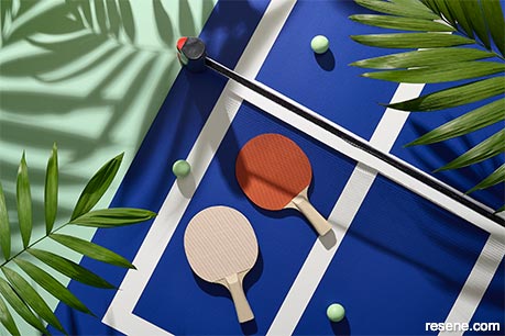
The restlessness of being stuck at home, both within our own walls and within our own borders, has got us itching to find some fun – which may be why trending colours are reflecting hues from favourite games. Background in Resene Summer Green (left), court in Resene Decadence with lines in Resene Snow Drift, paddles in Resene Just Right (left) and Resene Kamikaze (right) with handles in Resene Coral and balls in Resene Feijoa.
There may be more tools than ever before to gain insight into colour trends but making the call on what’s about to be hot and what’s definitely not hasn’t exactly been easy lately. In previous issues, we’ve pointed to the impact of global supply chain issues, which have worsened. Beyond the effect unfathomable lead times have had on our projects, it also means that colour trends aren’t rolling out the way they used to.
Normally, we have a pretty good idea of what’s coming down the pipe even two to three years out because that’s how far in advance fashion designers start working on their looks – which is where the majority of trends start before trickling down to other industries. Colour trends in the architectural, interior design, landscape design and building spheres don’t change as drastically as they do in the world of fashion, though. Hues in our industries are more likely to take on subtle shifts: warming up, cooling off or taking on a new undertone. And rather than significant colour changes occurring seasonally as they do in fashion, ours become more dramatic over the course of years.
Because of the pandemic, many fashion and design launch events aren't happening as planned. And then due to logistical issues, it's become a serious challenge for products to roll out to market in succinct capsules as planned. The same thing is happening to furniture, homewares and building material suppliers as clothing stores: what you see in shops might not be displayed in cohesive collections like you're used to, where everything falls into a palette of five to seven distinct colours that can be remixed into dozens of combinations and ratios. Instead, you might find a mishmash of old and new stock with the most desirable items on backorder or sold out. If you used to rely on these signals to help put together your colour palettes, you might be in for some trying times for the foreseeable future – or you could've been if you weren't reading this.
Even if our crystal ball is foggier than usual, there are still plenty of trends we’ve identified which are worth keeping an eye on. As it turns out, some of the situations that are holding back the ‘planned’ trends from ticking along as usual are the exact same things spurring new ones. Here’s what we’re counting on seeing play out over the next six to twelve months, what the trends are stemming from and tips for working these top Resene hues into your upcoming projects.
With every challenge comes opportunity. If you can’t rely on being able to get your hands on something new to complete your project, you may need to reinvent something old – and what better tool for that than paint? Instead of people sharing their latest purchase, our social media feeds have been chock-full of folks rolling up their sleeves and taking new colours to their existing walls, floor, furniture and more. Truth be told, there’s nothing like being locked down in an all white or cold grey scheme that was meant to ‘optimise resale value’ to make a client realise that staring at all white or cold grey walls for weeks on end is not good for their mental health.
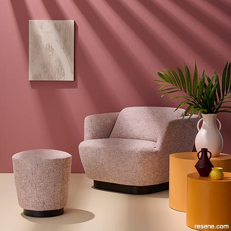
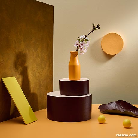
Rosy tones are known mood improvers and evoke comfort and cosiness – but how you light them is very important for getting the right vibe. Wall in Resene Coral Tree, floor in Resene Half Splash, tables in Resene Sunshade (large) and Resene Outrageous (small), textured artwork in Resene Alpaca over Resene EzyFill and vases in (from large to small) Resene Karry, Resene Volcano and Resene Wild Thing. Armchair and ottoman from King.
This year’s Resene Total Colour Awards saw a record number of heritage projects submitted, so it seems that the pandemic has had a major impact on driving decisions to fix up older buildings rather than starting from scratch. Whether it’s because the price of timber and other key building materials has skyrocketed or those who normally spend their savings on trips abroad have finally gotten around to fixing things up, we’re happy to see so many opting to preserve architectural gems.
Plus, now that items like furnishings which used to be quick and easy to get a hold of have months and months of lead time, there’s been a move to reclaim, repair, restore and reupholster items that might have been destined for the landfill – a trend that’s great for the budget and the planet. Further study may be needed, but we think there is a special kind of dopamine released when you snag a bargain on something with a great form from a second-hand shop and see it magically transformed with a fresh coat of paint colour. If you’ve been there, you’ll know what we mean.
With all this refurbishing and reinventing, it’s unsurprising that there has been a turn towards pastoral colours – think turn-of-the-century villas decked out in vintage-appropriate hues like Resene Juniper, Resene Yucca, Resene Coral Tree, Resene Dust Storm, Resene Sante Fe, Resene Desperado and Resene Felix. This is likely why time-honoured beloved warm whites like Resene Bianca, Resene Villa White and Resene Spanish White are making a strong resurgence as well.
Cottagecore – a concept that embraces a simpler, sustainable existence that is more harmonious with nature – is also buzzing on social media. Aesthetically, it’s a nostalgic nod to the romance of traditional English countryside style, so if you’ve got a rustic locale that you’re not sure how to treat it, lean into this trend by bringing in soft, warm pastels like Resene Haven, Resene Tuft Bush, Resene Coral, Resene Half Splash, Resene Karry, Resene Alpaca and Resene Half Spindle. And you can’t go wrong incorporating checks, plaid or gingham, which are some of the most popular patterns out there right now.
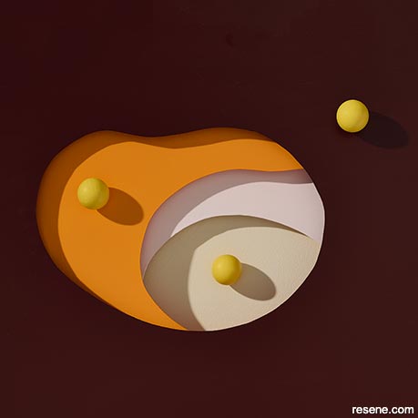
It’s been hypothesised that tumultuous events like the global increase in protests is influencing colour trends, bumping up the popularity of hues that are linked to revolution and passion – particularly, fiery reds and oranges such as Resene Kamikaze and Resene Outrageous. But another explanation could be tied to the general restlessness of being stuck in the same place for weeks, months or even years on end. These times haven’t been easy, and most of us are sick and tired of being sick and tired, so it makes sense those who are eager to get back to living life fully are going to be drawn to livelier colour choices that embrace that sense of energy.
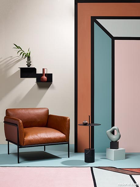
Not only are people making bolder colour choices in general, but we’re also seeing more painted wall designs and murals than ever before. This design mimics the coloured lines of the statement rug, adding playful energy and dimension to the space. Back wall in Resene Travertine, return wall (right) in Resene Sante Fe, Resene Juniper, Resene Paris White and Resene Dust Storm with lines in Resene Nero, floor in Resene Juniper, sculpture in Resene Yucca with mount in Resene Nero, box in Resene Paris White, vase (on shelf) in Resene Desperado, and tiny pot (on table) in Resene Felix. Chair and side table from Bauhaus, rug and shelf from Good Form.
Many bold and bright hues have been shown to be major mood improvers and painting your project in these colours is a timeline-friendly reachable remedy for any typology or budget. For instance, a pop of sunny statement yellow like Resene Wild Thing can’t help but make an onlooker cheerful. Rosy tones are also proven uplifters, so while pinks might have been on the way out pre-pandemic, our current circumstances have helped resolidified their hold in the world of on-trend colours. If you or your client are wary to think of pink for your project, forgo truer options for blush beiges like Resene Alpaca, Resene Cashmere or Resene Just Right – which, as the name implies, is pretty much the perfect feel-good hue.
There aren’t many dark colours to speak of when looking to the long-range trend horizon, with a couple of notable exceptions. Navy blues like Resene Blue Night continue to be favourable choices when you’re looking for more character than black or charcoal greys can muster. The deeply caffeinated espresso browns that have recently come into vogue, such as Resene Rebel, are set to shift into redder and purplier territories while still maintaining their depth – look to hues like Resene Half Aubergine and Resene Volcano to get in early on this trend. The best part is these hues are ideal for grounding the previously mentioned chipper colours, and a well-balanced palette with a good dose of contrast is something we can all feel good about.
Just because we're adults doesn't mean that our lives need to be all about work; whether that's at our jobs, at school, at home, parenting, community initiatives or any combination of the above. Those who have made the shift to working from home – whether it's sometimes, all the time or only during lockdown – will know what a concerted effort you need to make to maintain boundaries when business and family life inevitably blend. While it's clear we need more time in our schedules for relaxation and rejuvenation, we also need to create more opportunities for play – the kind that's been scientifically shown to relieve stress, improve brain function and your relationships with others.
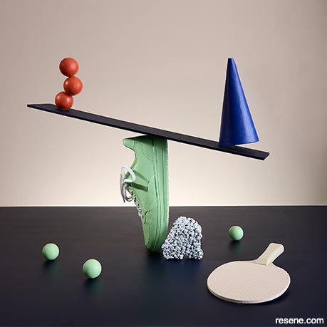
When we managed to carve out some leisure time before the pandemic, we were more likely to zone out in front of our screens than engage in fun, rejuvenating, active play like we did as children. But after spending all day stuck in front of a screen, we're rediscovering the joy and charm of traditional games. Board games from the complex through to classics like chess have been trending, but so have physical ones such as cornhole and skittles. If you need proof of how popular these activities have become, just ask us how hard it was to get a table tennis set for our photoshoot (spoiler alert: it wasn't an easy feat).
Games also seem to be impacting colour and design trends, with the same punchy, eye-catching hues you'd see whether you're playing on the field, on the court, in your backyard or at your dining table. Resene Summer Green, Resene Feijoa, Resene Decadence, Resene Sunshade, Resene Wild Thing and Resene Kamikaze are all colours that spell fun – and they have just the kind of spontaneous energy our projects need right now. Combine a few for a 'go big or go home' vibe or even just add a small taste to trims or fascias to bring light-hearted fun to your project.
If you, like us, learnt how to draft with a pencil and paper, the extent of your colour rendering skills might be layering Copic markers on the back of a sheet of vellum. You might also share in the awe and jealously we feel when we see the brilliant quality of renders that young designers are creating digitally these days, where you have to look twice to know for sure whether it’s real life or just fantasy – a line that’s getting blurrier than ever before.
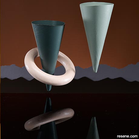
Technological advancements in manufacturing and an increase in availability of 3D printing means that forms that could previously only exist as renders can become reality with a shocking level of ease. Designers no longer need to be skilled carpenters or sculptors to turn their visions for furniture and accessories into objects. These items don’t just need to be one-offs either, as they can be reproduced with the click of a button. While modelsized 3D printing often uses layers of extruded plastic to build up forms, large-scale technology is extruding cement in the same manner; the ‘printer’ effectively traces the floorplan until enough layers have been applied for walls to reach the required height.
These sorts of developments are already game changers, and we’re seeing far more sculptural furnishings and building styles emerging. It’s more achievable than ever for things that could previously only exist in fantasy as a render to be translated to reality. Currently, this trend is still in very experimental stages, so the colours that are associated with it are also quite dreamy and surreal like Resene Greywacke, Resene Tuft Bush and Resene Haven. But these are being offset by hues like Resene Dark Slate, Resene Rolling Stone, Resene Sante Fe and Resene Element that anchor the looks back in the real world.
While the colours and materials you can 3D print with don’t offer a superb range of choices yet, don’t forget that all of these substrates are generally paintable with Resene paint colours to bring your 3D product into your chosen colour palette. Even if the world of 3D manufacturing still feels a bit over your head, the same advice is going to help us weather the logistical challenges that are likely to get worse before they get better: paint it ‘til we make it.
› For the latest on colour trends as they continue to develop and to get alerted to new trends as they emerge, follow the monthly updates on our blog at www.blackwhitemag.com.
Styling: Laura Lynn Johnston
Images: Bryce Carleton
This is a magazine created for the industry, by the industry and with the industry – and a publication like this is only possible because of New Zealand and Australia's remarkably talented and loyal Resene specifiers and users.
If you have a project finished in Resene paints, wood stains or coatings, whether it is strikingly colourful, beautifully tonal, a haven of natural stained and clear finishes, wonderfully unique or anything in between, we'd love to see it and have the opportunity to showcase it. Submit your projects online or email editor@blackwhitemag.com. You're welcome to share as many projects as you would like, whenever it suits. We look forward to seeing what you've been busy creating.
Earn CPD reading this magazine – If you're a specifier, earn ADNZ or NZRAB CPD points by reading BlackWhite magazine. Once you've read an issue request your CPD points via the CPD portal for ADNZ (for NZ architectural designers) or NZRAB (for NZ architects).
![]() Get inspired ! Subscribe
Get inspired ! Subscribe ![]() Get saving ! Apply for a DIY card
Get saving ! Apply for a DIY card
![]()
Can't find what you're looking for? Ask us!
Company profile | Terms | Privacy policy | Quality and environmental policy | Health and safety policy
Colours shown on this website are a representation only. Please refer to the actual paint or product sample. Resene colour charts, testpots and samples are available for ordering online. See measurements/conversions for more details on how electronic colour values are achieved.
What's new | Specifiers | Painters | DIYers | Artists | Kids | Sitemap | Home | TOP ⇧


