From BlackWhite magazine - issue 03, Resene Total Colour Awards
A strong selection of winners were recognised at this year’s Resene Total Colour Awards.
In Resene’s 75th year, it seems fitting that the latest Resene Total Colour Awards have been a true celebration of all things colour. From neutral to bright, pastel to weathered, each winner’s palette is distinctively unique in hue – yet all share an excellence in colour selection.
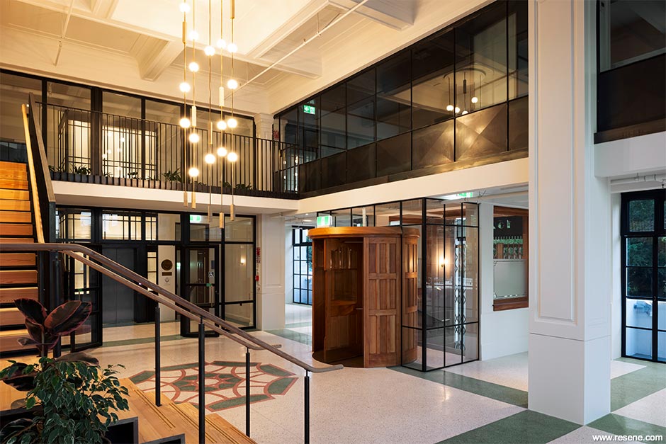
It was captivating colour which beautifully complements its classical architecture that won Christchurch’s Public Trust Building the top colour award for 2021. The project was bestowed both the Resene Total Colour Master Nightingale Award, named after the Nightingale family who founded and still run Resene today, as well as the Resene Heritage Award. The project features Resene Blanc, Resene Half Beryl Green, Resene Jaguar, Resene Smoky Green, Resene Sanguine Brown and Resene Wan White – authentic selections which pay homage to the building’s rich history.
The Resene Total Colour Awards were launched to encourage and celebrate excellent and creative use of colour; to showcase striking colour palettes and combinations and provide fresh inspiration – and this year’s submissions did not disappoint. As so many projects have been delayed over the last 18 months, there was a pronounced shift to making the most of what already exists, with many older projects lovingly brought to life with painstaking attention to detail, care and fresh coats of new Resene colour. It did not go unnoticed by the judging panel, which included Sylvia Sandford (colour expert), John Walsh (previous editor of Architecture, architecture writer) and Laura Lynn Johnston (editor of BlackWhite magazine, previous editor of habitat magazine).
Congratulations to all the winners and runners up and heartfelt appreciation to all those who took the time to share their incredible work.
Three Sixty Architecture
The Public Trust Building
Judges: “A proud winner, this building has a captivating presence. The quality of the finishing, the colour palette and the architecture all fit perfectly and are just right. The colours bring out the calibre of the building and feel at one with the strength of the architecture. This project has been treated with years of dedicated effort and respect, holding onto and preserving history with a delightfully classical treatment.
“Very serene, beautiful and so distinguished, there is something indescribably magnetic about this building. The palette and project are perfectly paired – glorious, grand and together they combine as a fitting way to honour the work of one of Christchurch’s greatest architects. The colours emphasise the historical façade and features in an enduringly appropriate amalgamation.”
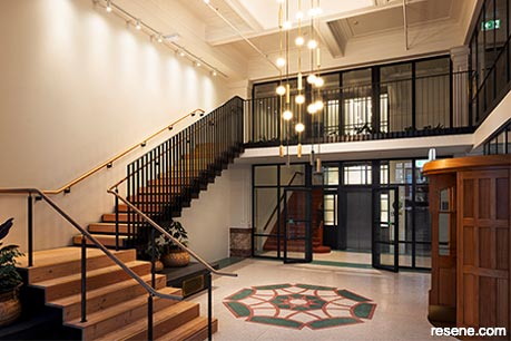
1. Master Nightingale Award and Heritage Award
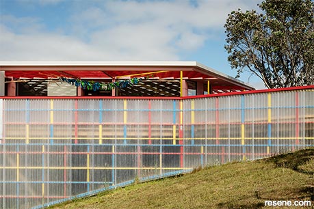
2. Education Award
Bull O’Sullivan Architecture
Te Kōhanga Reo o Ngā Pihi o Te Purapura Pai
Judges: “A warm welcome awaits. Colour is used strategically to highlight and draw attention, carefully placed in context and in consideration of sightlines to enhance the building. It’s a purposeful palette that brings together a unique colour combination to provide a distinctive and supportive environment for young minds to explore, flourish and create.”
Rachel Xu, Pacific Environments NZ Ltd
Huapai District School Block 2 Refurbishment
Judges: “This project reinvents space using paint, colour and creative colour blocking to stretch the imagination and support school life. Carefully pairing colour with purpose, each hue helps to reinforce the use of each space. The staff area is a sanctuary wrapped in relaxing calm hues, a far cry from the invigorating fun colour in the creative maker space.”
3. Education Colour Maestro Award
4. Rising Star Award
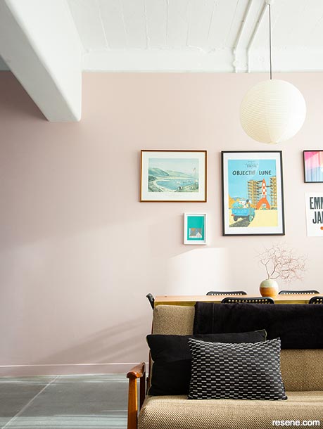
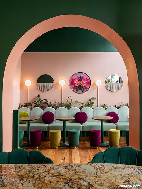
Belinda Burke
Colour, Hell of a Good Thing!
Judges: “Decorative, beautiful, yet practical, this colour concept has been carefully thought through. The colour palette is anchored and persuasive, purposefully celebrating colour with detailed reasoning for its use, balanced with clear finishes. Filled with light and a bright energy, the palette draws on experiences of the past, capturing travel memories in a new application.”
Qun Zhang
Healing
Judges: “As if merged with a heady daydream, the colours are viewed in a permeable way in context with the view that lies beyond. The palette wraps in the spirit of the landscape with a lightness and ethereality that truly delights the senses and feeds the soul in a gloriously uplifting way.”
5. Rising Star Colour Maestro Award
6. Residential Interior Award
Kate St James and Catherine Whitting,
St James Whitting Galleria Sanctum
Judges: “Colour purposefully defines each space to imbue it with its own mood and personality. Careful consideration of sightlines from one room to the next takes you on a curated colour journey. The artwork and the colourways play off each other, providing a perfect environment in which the beauty of the artwork flourishes.”
Shaw & Shaw Architects
College Street Apartment
Judges: “Cosy but not closed in, this project achieves a lot in a small space, working mindfully with the age of the property to enhance each space while still being sympathetic to its era. With a focus on easy living, the colours come together into a sophisticated palette with memorable touches of colourful surprises.”
7. Residential Interior Colour Maestro Award
8. Residential Exterior Award
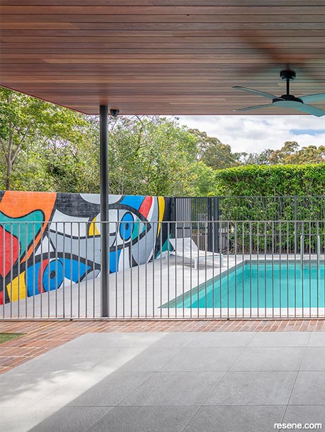
Belinda Edmunds, hungerford + edmunds
Pymble House
Judges: “This home has a well-defined personality with its strong horizontal features emphasised through accent colour. The hues are chosen thoughtfully and in sympathy with the environment linking together the public and private faces of this home, culminating in a creative riot of colour on the poolside mural for added frivolity and fun.”
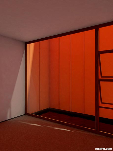
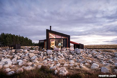
Barry Connor, Barry Connor Design
Skylark Cabin
Judges: “Colours and materials are juxtaposed to accentuate their beauty. The dark wood stain cleverly plays off the rocky landscape while the burnt bold orange accents harness the smouldering heat of a volcano to frame features. It’s a colour-fuelled reminder to us all that colour brilliance is not just the colours you choose but how you choose to embrace them through the architecture.”
9. Residential Exterior Colour Maestro Award

10. Community Award
Burgess Treep & Knight Architects
Whare Koa Māngere Community House
Judges: “Bringing the voices of many together, this is truly a happy place – where all ages and all cultures can mix and mingle in a vibrant environment. The colour draws attention to the age of the house then elevates and embraces it with a welcoming hug of hues, inviting in all. It’s brimming with love, pride, community and the warmest of warm fuzzies.”
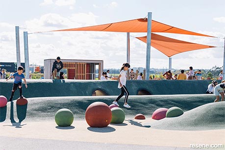
Nina Rattray and Claire Leisching of Auckland Council
Kopupaka Reserve Playground
Judges: “Colour has been used to activate and elevate this space for all to enjoy. The hues go beyond a predictable playground palette while still bringing together a colourful bouquet that is lively and inviting. With many elements touched by colour, it comes together in a subtle symphony that dances gently from one structure to the next defining each area without overwhelming it.”
11. Colour Landscape Award
12. Landscape Colour Maestro Award
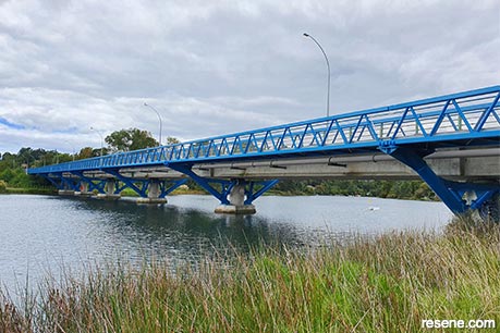
DC Structures Studio & Brian Perry Civil
Wairoa River Bridge
Judges: “There’s more to this project than meets the eye. For a structure where grey would have been an easy default option, this bridge pushes the boundaries – going bold with colour where so many have gone bland before it. While navigating the requirements of multiple stakeholders, structural needs and the approval process, the palette provides a fluid connection between water and movement with a clear, distinctive personality from the roadway running alongside.”
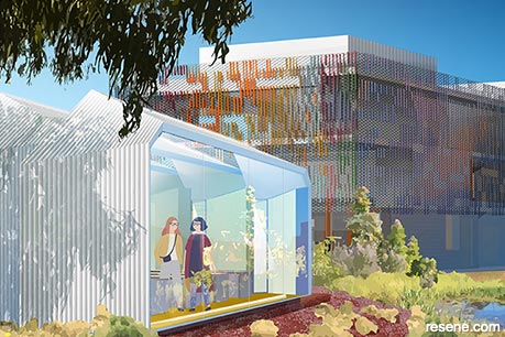
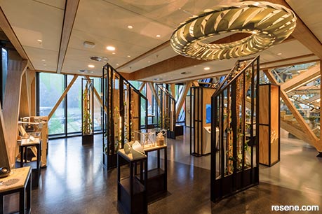
RTA Studio and Irving Smith Architects
SCION Innovation Hub – Te Whare Nui o Tuteata
Judges: “Strength in architecture and painstaking care has ensured no detail has been overlooked. The palette preserves and showcases the structure, with whitewash, clear finishes and neutrals allowing the timber elements to take centre stage. It’s a sophisticated integration of colour and architecture, with a continuity that connects each space and plays with light and movement.”
13. Neutrals Award
14. Neutrals Colour Maestro Award
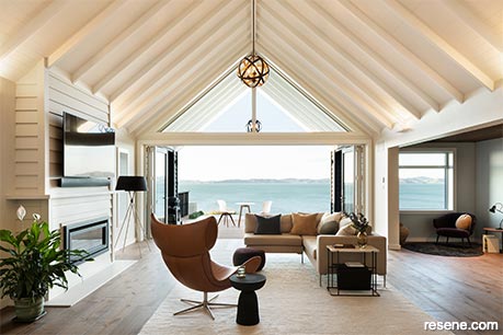
Lisa Day, Donnell Day Architects
Beachlands House
Judges: “A lovely backdrop to beach life, the neutral colour palette works beautifully with this light-filled home, where the hue strength and tone have been adjusted to suit each space and view. It’s lyrical and melodious, encouraging your eyes to slowly meander over the space and enjoy how the colour interacts with the lighting, texture and the cast of shadowing from the panelling. A perfectly composed palette.”
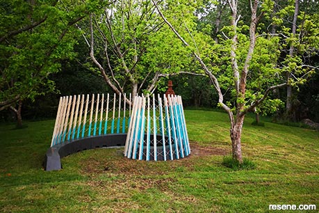
Anna Li and Topsy Steele, Boffa Miskell
Nohonga: Bioluminescence
Judges: “Whether viewed from inside or out, the palette of this creatively imaginative nohonga harnesses the natural phenomenon of glowing luminously and irresistibly. The colour rhythmically ascends over the classical architectural framework, drawing you deeper into the spiral and encouraging you to sit, linger and enjoy being surrounded in the beauty. The work is graceful and dynamic, but still breathes.”
15. Installation – Experiential – Product Award
16. Installation – Experiential – Product Colour Maestro Award
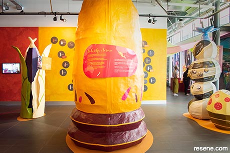
Lee Davidson and Krissy O’Connor, Victoria University of Wellington/Dare To – Special Projects Agency
De la Milpa a la Mesa – A Mexican Food Journey
Judges: “A fiesta of colour, this exhibition wholeheartedly embraces bold colour in a celebration of Mexican culture. Working with a wonderful base of masterful and overscaled papier mache, the design team has taken a no holds barred approach to colour to capture the imagination of visitors, encouraging them to actively get involved with the interactive parts of the exhibition that have been wrapped into the feast of colour.”
Brett and Hollis Giddens
gin gin – cocktail bar + eatery
Judges: “Splashed inside and out in a cocktail of intoxicating colour, the palette entices you inside you with a tantalising taster of what lies within. The quality of the fitout is unquestionably top shelf. It makes the most of the architecture with a bold palette of colours carefully intertwined with each other for a daring sense of occasion.”
17. Commercial Interior Public + Retail Award
18. Commercial Interior Public + Retail Colour Maestro Award
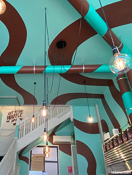
Steve Rosling, Element17
Waffle Haus
Judges: “Yum! Tantalising and tasty, the fun placement of these colours gives a sense that this building is literally drizzled with colour, oozing chocolate from tip to toe. The colour is ever so carefully wrapped over all spaces, with pipes and rails that are reminiscent of striped paper straws. It’s a totally delicious escape from reality.”
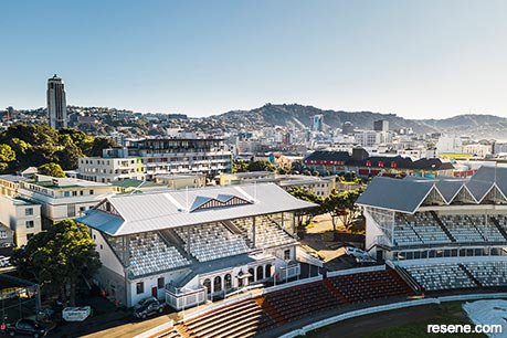
Shand Shelton
Cricket Museum Stand Restrengthening
Judges: “Handsome and distinguished, this entirely appropriate colour palette showcases the architecture of the building. With so much physical ornamentation the colour has been used judiciously to subtly highlight the details, so you appreciate it in its totality. The lighter palette is entirely appropriate for a summer-focused game and a desirable calming force in the midst of busy city life.”
19. Commercial Exterior Award
20. Commercial Exterior Colour Maestro Award
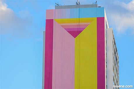
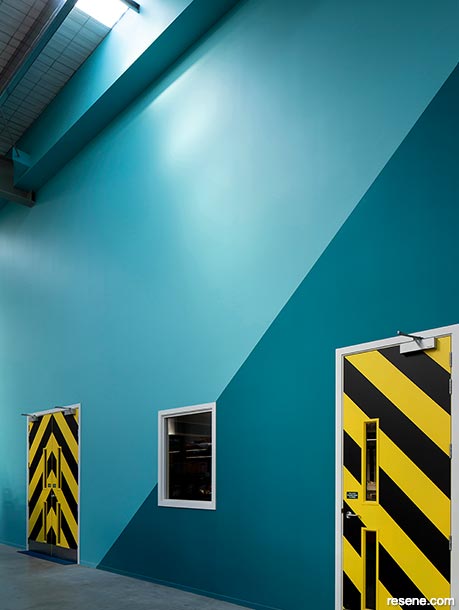
Will Cooke
As One Door Closes, Another Opens
Judges: “This explosion of colour brightens up and demands attention of a once white space. The clever large-scale design is perfect to appreciate when viewed at a distance, while the ‘doors’ welcome you in and invite you to look a little closer. It’s vibrant, unexpected and just the colour needed to brighten each day.”
Clark Pritchard, StudioPritchard
New Zealand Bus Head Office & Operations Centre
Judges: “A home away from home, this office space brings the comfortable feel of working from home into a supportive environment for staff to enjoy their workdays. Colour supports the office design with sympathetic and mindful colours that transition with ease from one space to the next. The hand-painted mural delves into the detail, cleverly celebrating the company’s key role and pride in keeping the city moving.”
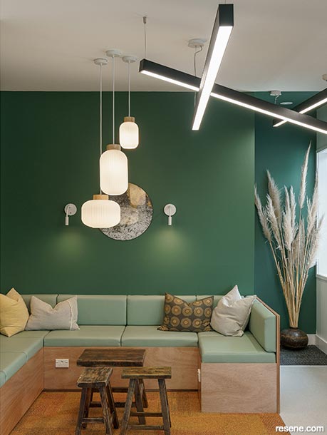
21. Commercial Interior Office Award
22. Commercial Interior Office Colour Maestro Award
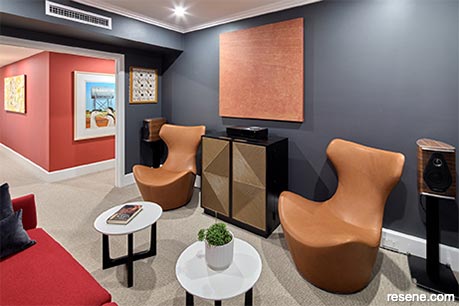
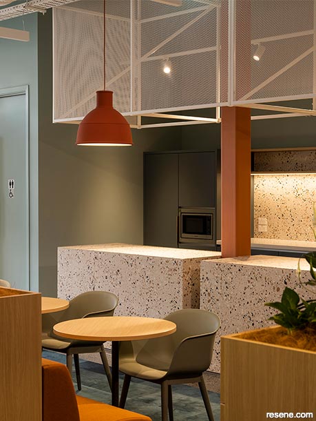
Daniel Sullivan, Common Ltd, with Jenna Ingram
Cosmic Corner Headquarters
Judges: “Joyful and creative, the colour selection and placement feel true to the brand’s energy and vibrancy. It plays on the psychology of colour, cleverly using energetic colour in the meeting room to spark ideas and encourage energy moving through to more restrained choices in chill out areas. This colour palette completely brings this office space to life.”
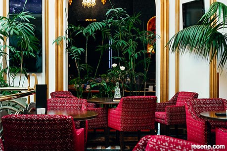
Annie Simpson King, Simpson King Design
Grand Casino Dunedin
Judges: “This project was designed to bring back the ‘wow’ and bring back the ‘wow’ it has. The sumptuous colour palette and metallic hues play to the decadence and opulence of a grand night out. Richly layered, it’s testament to the passionate purpose to recapture and enhance this grand building’s beauty to appeal to the guests of today.”
23. Heritage Colour Maestro Award

24. Heritage Colour Maestro Award
Keri Mason and Raewyn Dailey
Napier Antique & Jewellery Centre
Judges: “In true Art Deco style, this palette emphasises the beauty of the building’s design period with authentic colour choices. Details are ever so carefully highlighted with painted colour contrasts. The depth and tonality of the colours are balanced beautifully drawing admiring attention to this corner site. It’s a joy to see it detailed so well.”
› Selected projects are featured in this issue of BlackWhite magazine. Keep an eye out for more on other projects in future BlackWhite and habitat by Resene newsletters and publications. For details on all of the Resene Total Colour Award winners, visit www.resene.com/awardwinners.
This is a magazine created for the industry, by the industry and with the industry – and a publication like this is only possible because of New Zealand and Australia's remarkably talented and loyal Resene specifiers and users.
If you have a project finished in Resene paints, wood stains or coatings, whether it is strikingly colourful, beautifully tonal, a haven of natural stained and clear finishes, wonderfully unique or anything in between, we'd love to see it and have the opportunity to showcase it. Submit your projects online or email editor@blackwhitemag.com. You're welcome to share as many projects as you would like, whenever it suits. We look forward to seeing what you've been busy creating.
Earn CPD reading this magazine – If you're a specifier, earn ADNZ or NZRAB CPD points by reading BlackWhite magazine. Once you've read an issue request your CPD points via the CPD portal for ADNZ (for NZ architectural designers) or NZRAB (for NZ architects).
![]() Get inspired ! Subscribe
Get inspired ! Subscribe ![]() Get saving ! Apply for a DIY card
Get saving ! Apply for a DIY card
![]()
Can't find what you're looking for? Ask us!
Company profile | Terms | Privacy policy | Quality and environmental policy | Health and safety policy
Colours shown on this website are a representation only. Please refer to the actual paint or product sample. Resene colour charts, testpots and samples are available for ordering online. See measurements/conversions for more details on how electronic colour values are achieved.
What's new | Specifiers | Painters | DIYers | Artists | Kids | Sitemap | Home | TOP ⇧


