From BlackWhite magazine - issue 02, gold standard
Lyttelton Port Company’s post-quake headquarters consolidates divergent work groups for a more collegial and functional workplace.
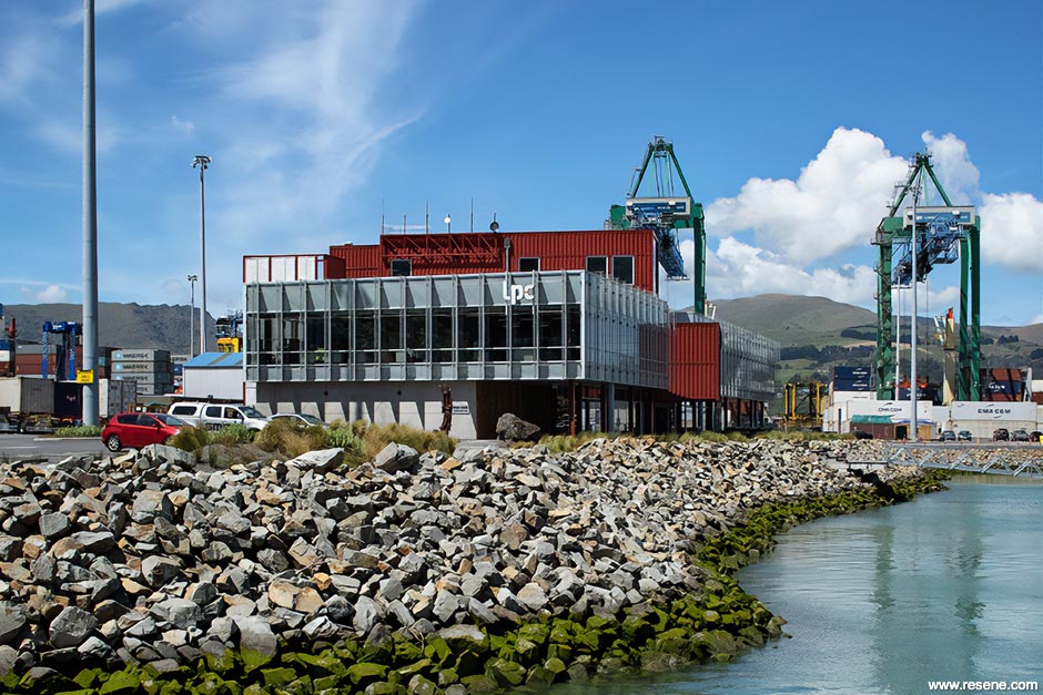
Managing the largest port on New Zealand’s South Island, Lyttelton Port Company (LPC) operates the gateway for goods that keep the Banks Peninsula and the greater Canterbury region moving. It’s a big job, one that was understandably disrupted when the Canterbury earthquakes struck in 2011. The disaster saw their administrative headquarters damaged beyond feasible repair and given that their container terminal building was no longer fit for purpose, the situation offered an opportunity for LPC to start fresh and consolidate their administration and port staff under a single roof. That choice to unify employees of all hardhat and collar colours was the biggest driver in the decision to build new headquarters, and what shape it would need to take.
From the client’s perspective, this was the biggest challenge to overcome. “Integration of our 24/7 works and 9-5 staff into a single space had never been achieved previously at the port, so there was a good level of scepticism as to whether it could actually work,” explains Mike Simmers, General Manager of Infrastructure and Property for LPC. “We wanted to provide something that everyone could be proud of while also ensuring it was practical and hard-wearing enough that we wouldn’t be constantly repairing or altering materials and finishes.”
“Since the administration staff work traditional office hours while port staff operate on shifts 24 hours a day, 365 days a year, a range of working styles needed to be considered,” says Project Architect Pippa Ensor of Athfield Architects. But the design team also needed to find ways to create common ground for the two disparate work groups, so they undertook testing with LPC to determine how to best handle different work styles and solutions for the resulting workspace design.
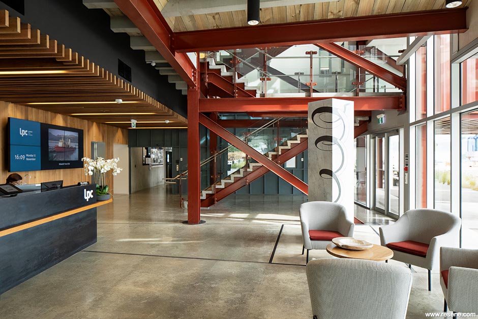
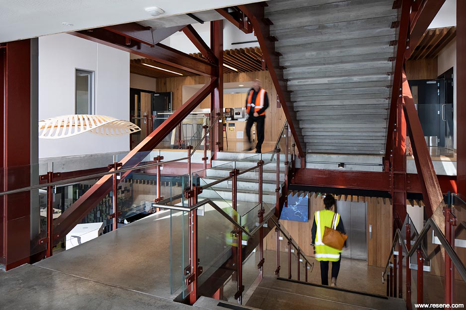
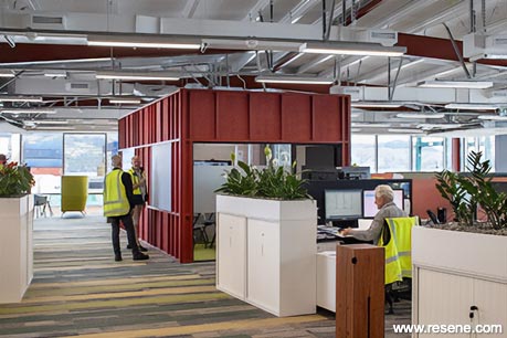
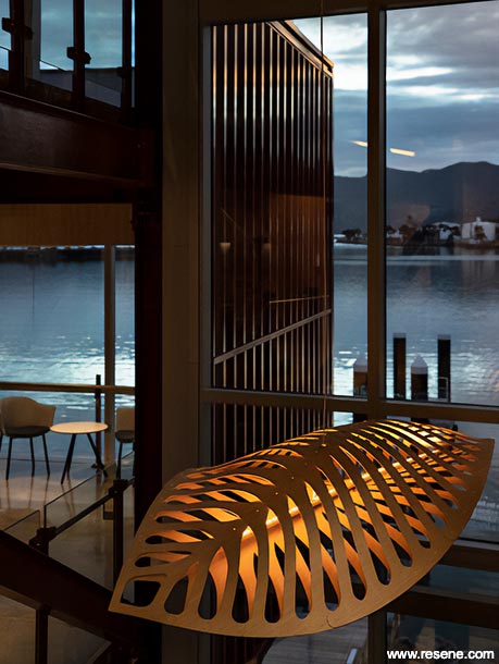
What they garnered from the exercise was a strong desire for shared common spaces along with more collaborative working areas and open plan workspaces based on activity rather than the hierarchical structure of the business. Within the workspace, strategic placement of furniture and meeting pods was key in ensuring a practical workplace was established, opening up links that cellular office spaces and physical distance between teams often deny. The unique working port environment also played a significant role in Athfield Architects’ design, influencing everything from the structural expression of the mixer stair to the design of key joinery items – creating a building at one with its environment, the rich history of the port and the occupants within it.
Pippa says a coordinated health and safety approach was at the forefront in responding to the challenges of the site, which is constrained on three sides by a busy working port and a harbour on the fourth. “The entire team worked closely to resolve the various construction challenges, such as pile driving or large precast panel delivery, to create an outcome that both kept people safe and the port working.”
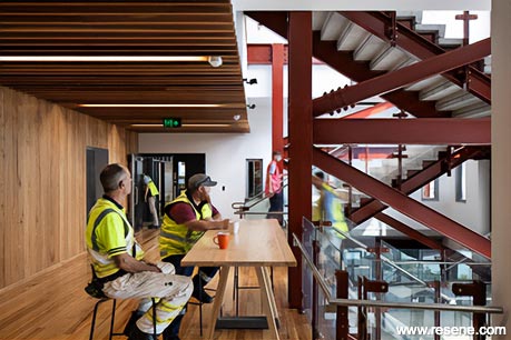
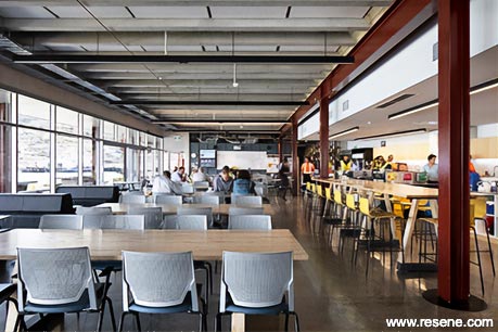
Given the hard-working environment, all of the project’s finishes needed to be durable and easy to clean, but they were also seen as a method for creating a unique character and resiliency within the building – one that is equally inviting as it is practical for the 500+ port staff. Locally-sourced materials such as the recycled timber from the former wharf were chosen for the interior lining along with custom joinery and landscaping works as a way to speak to the site’s history and honour the generations of strong men and women who have worked at the port.
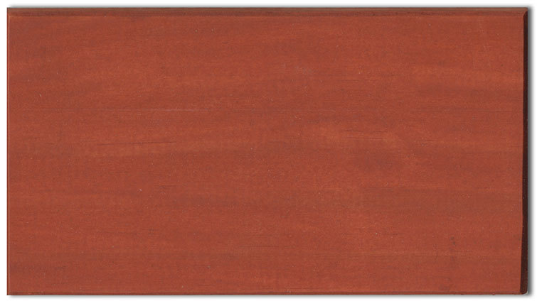
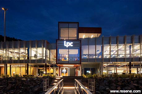
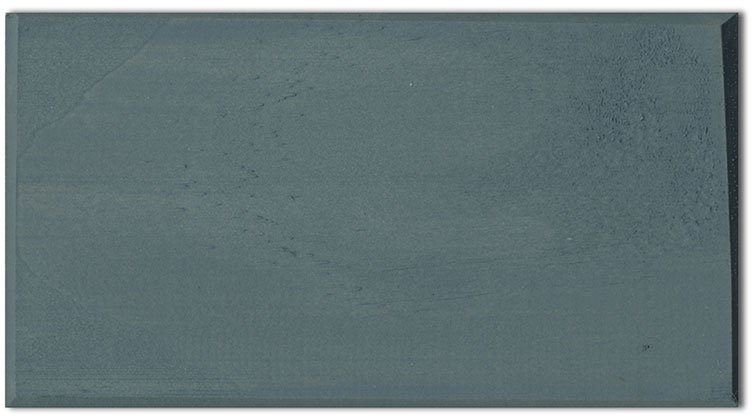
The interior palette references tones from the surrounding Port Hills, creating a building grounded in nature, while being constructed as part of the manufactured port landscape. Bespoke meeting pods, each uniquely coloured, act as markers within open plan spaces, aiding in wayfinding and demarcating different workspaces while supporting operational tasks, including the presentation of large nautical maps. Pippa says that three timber stain colours were selected to represent and complement the port and surrounding landscape: Resene Colorwood Totem Pole to reference nearby shipping containers, Resene Colorwood Pickled Bluewood for the harbour and Resene Colorwood Kumera for the yellows present in the surrounding hills. External profiled metal cladding painted in Resene Fahrenheit also takes its colour and detailing from the nearby shipping containers and wraps into the interior, adding to the palette of tactile materials while the open stairs echo the forms of the cranes prevalent throughout the port.
Did you know? As well as its own colour range, Resene Colorwood wood stain can also be tinted to Resene Waterborne Woodsman colours so you can continue the exterior stain colour into the interior.
Luis Augusto, Senior Project Manager for Naylor Love, says that constructing the building without interrupting port operations was definitely among the biggest challenges. “It was a tight space to work in, as it’s set on reclaimed land adjacent to the sea wall and subject to constant heavy traffic as transport trucks bring goods in and out. But Naylor Love’s experienced project team ensured operational continuity through clear and consistent communication with stakeholders and the port’s users throughout the works, including timely and accurate notice of potential disruptions,” he says.
When the idea arose for the exterior cladding to mimic the look of shipping containers, the project team at Naylor Love helped brainstorm feasible solutions through the supply chain that would achieve the effect Athfield Architects was after. In the end, custom aluminium panels were folded on a press to give them the same geometry of the shipping containers – and it does it to great effect.
“The use of the reclaimed wharf timber in some of the elements of the building also presented some challenges in terms of sourcing and using the material,” says Luis. “But we were so pleased with the outcome – especially the client’s satisfaction and the quality of the build. It’s now a landmark feature of the Lyttelton Port.
“There was great collaboration from all the stakeholders involved: Lyttelton Port Company and their operations team, Athfield Architects, Structex, Beca and Naylor Love. All parties working together as a team was undoubtedly a decisive factor to achieve this project’s level of success.”
For Mike, the best part is the impact the new facility has made on those who work there. “The culture is definitely improving. There was a bit of frosty hostility to begin with, but that has changed significantly as time has gone on. We now see each other far more regularly and realise that we are all human and far more similar than we are dissimilar at the end of the day.”
His favourite details include the extensive windows, the mixer stair and the colour selections. “There is a real feeling of openness and great flow up through the centre of the building, and the colourful and highly acoustic meeting rooms definitely add to the ambience as well.”
“I think the Resene colour selections reflect us as an infrastructure business well. We are solid and dependable, and are deeply invested in our surrounding Lyttelton Harbour and the Port Hills. The colour palette was inspired by all of these elements and I think it is reflected beautifully throughout the building,” says Mike.
“Athfield Architects – and Pippa Ensor in particular – were fantastic throughout the process and really took the time to understand us as a business and reflect this through the design, finishes and use of colour.”
“In summary, it’s been a great success.”
Athfield Architects’ design team is equally proud of how the building has facilitated that cultural shift for LPC – creating an atmosphere that’s more aware, where collegiality and a sense of ownership are celebrated. “There are a number of the building and landscape elements that we are proud of, but the most rewarding aspect of this challenging project was the positive feedback received from those that use the building,” says Pippa. “That’s definitely the best part.”

Design: Athfield Architects
Build and painting: Naylor Love Construction
Structural engineering: Structex
Services and civil engineering: Beca
Landscape design: Canopy
Images: Simon Devitt
This is a magazine created for the industry, by the industry and with the industry – and a publication like this is only possible because of New Zealand and Australia's remarkably talented and loyal Resene specifiers and users.
If you have a project finished in Resene paints, wood stains or coatings, whether it is strikingly colourful, beautifully tonal, a haven of natural stained and clear finishes, wonderfully unique or anything in between, we'd love to see it and have the opportunity to showcase it. Submit your projects online or email editor@blackwhitemag.com. You're welcome to share as many projects as you would like, whenever it suits. We look forward to seeing what you've been busy creating.
Earn CPD reading this magazine – If you're a specifier, earn ADNZ or NZRAB CPD points by reading BlackWhite magazine. Once you've read an issue request your CPD points via the CPD portal for ADNZ (for NZ architectural designers) or NZRAB (for NZ architects).
![]() Get inspired ! Subscribe
Get inspired ! Subscribe ![]() Get saving ! Apply for a DIY card
Get saving ! Apply for a DIY card
![]()
Can't find what you're looking for? Ask us!
Company profile | Terms | Privacy policy | Quality and environmental policy | Health and safety policy
Colours shown on this website are a representation only. Please refer to the actual paint or product sample. Resene colour charts, testpots and samples are available for ordering online. See measurements/conversions for more details on how electronic colour values are achieved.
What's new | Specifiers | Painters | DIYers | Artists | Kids | Sitemap | Home | TOP ⇧