From BlackWhite magazine - issue 02, red alert
Nature and wellness remain key drivers of colour trends during challenging times, but there’s a brighter future ahead.
As the anniversary of the first lockdown measures passed, there was marked recognition of the changes that have impacted virtually every aspect of our lives. And like any anniversary, it offered an opportunity to reflect on just how much the past year has had a toll on our mental wellbeing and livelihood in a way we’ve never experienced before.
But with that discomfort came a reminder to slow down, look inwards and refocus on what’s important. It brought to light that our constant busyness may be clawing away at our quality of life and gave many a chance to take a breath and spend some quality time with their families. This shift has been by far and large the biggest factor in shaping both current colour trends and what’s yet to come.
As the global vaccination rollout gains steam, there is also a collective sense of hope hanging in the air. Finally, there is a light at the end of the tunnel, and while we’re not sure exactly when we’ll get there, this turn towards positivity has also had a profound effect on our long range colour forecast.
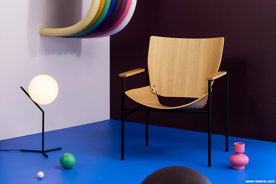
We look at the hottest Resene colours that are trending today and what colours we can look forward to.
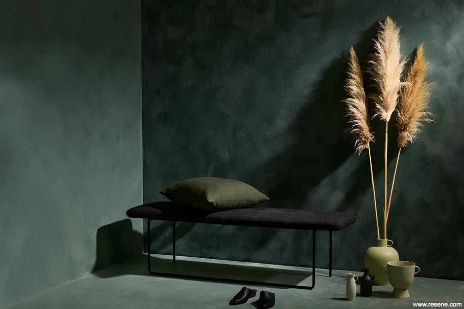
When we ask our specifying audience what inspires them, the most common answer is their local natural surroundings. Whether it’s hues pulled from the expansive sea and sky or lush native forests, there’s no stopping the popularity of dusted blues and greens. Not only do colours like Resene Gothic, Resene Rainee and Resene Celtic work well within the complexities of our harsh UV-laden light, they also carry an inherent energy of rejuvenation. As animals at heart, it’s innate for our habits and energy to follow the ebbs and flow of nature’s cyclical path. And after a difficult ‘season’ of focusing on our survival, we know that surrounding ourselves with these colours is just what the doctor ordered.

Thanks to the internet, clients are also more educated on colour theory and design principles than ever before. With knowledge about the psychological benefits of biophilic design becoming more mainstream, its popularity is on the rise among clients looking to increase connectivity to the natural environment through the incorporation of direct and indirect natural elements. While this trend was initially driven by design experts, it seems the desire to strengthen the tie between our interiors and exterior surroundings is being driven by savvy consumers as well.
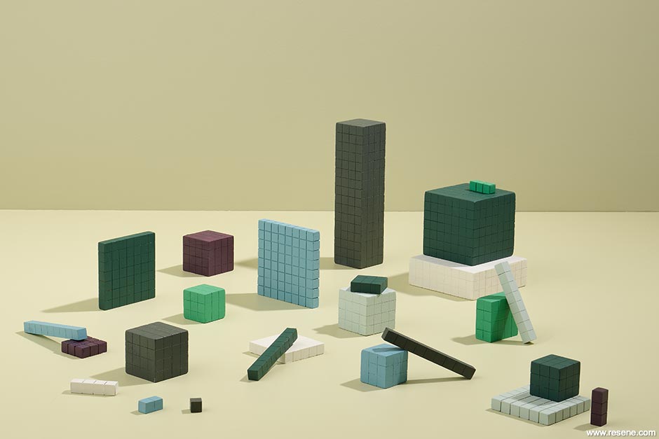
Where cooler colours have dominated the popular palette in the past two decades, we’re seeing a strong shift towards warmer undertones, with hues like Resene Bianca and Resene Possessed gaining traction. The same goes for our nature-inspired hues, with silver sages making way for salty celery greens like Resene Nirvana and evergreens and emeralds transitioning to saturated olives like Resene Seaweed – which make a lovely complement to popular red terracotta hues like Resene Hot August. When it comes to blues, look to colours like Resene Ziggurat and Resene Navigate to bring warmth to coastal palettes.
We often turn to nostalgia for comfort. It’s a habit that has impacted colour trends through an increased demand for tones that were popular in the 70s and those hues are still holding strong. But it’s the sharp turn away from our reliance on cool grey as the key neutral that we see as a trend that’s here for the long haul.
Coffee and chocolate browns from milky Swiss whites through to deep cocoas are trending – especially those characterised by complex undertones, which makes them a far cry from the variations that dominated in the 70s and 90s. The subtleties of sleek and supple Resene Otter and fully saturated Resene Kilamanjaro, in particular, make them frontrunners for becoming go-to palette grounders.
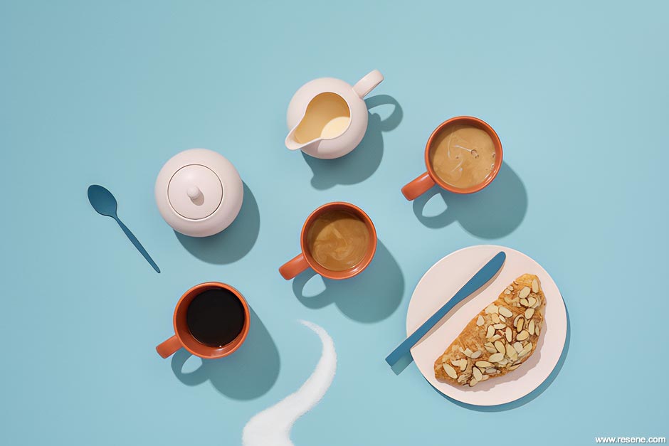
In the aftermath of a year like no other, it’s clear that we’re ready for a more positive perspective – and our longer range forecast does not disappoint. We’re soon to see a sharp rise in punchy colours that will be sure to put some more pep in our step. For starters, golden yellows like Resene Sandbar and Resene Hot Toddy, which have perennial popularity in Australia, will be popping up on the eastern side of the Tasman as well. And if that’s not enough to get you fired up, watch for electric blues like Resene Aviator and Resene Half Resolution Blue, plums and raspberry reds like Resene Half Aubergine, Resene Mulberry and Resene Vanquish and enthusiastic greens like Resene Home Run that will really get the motor running.
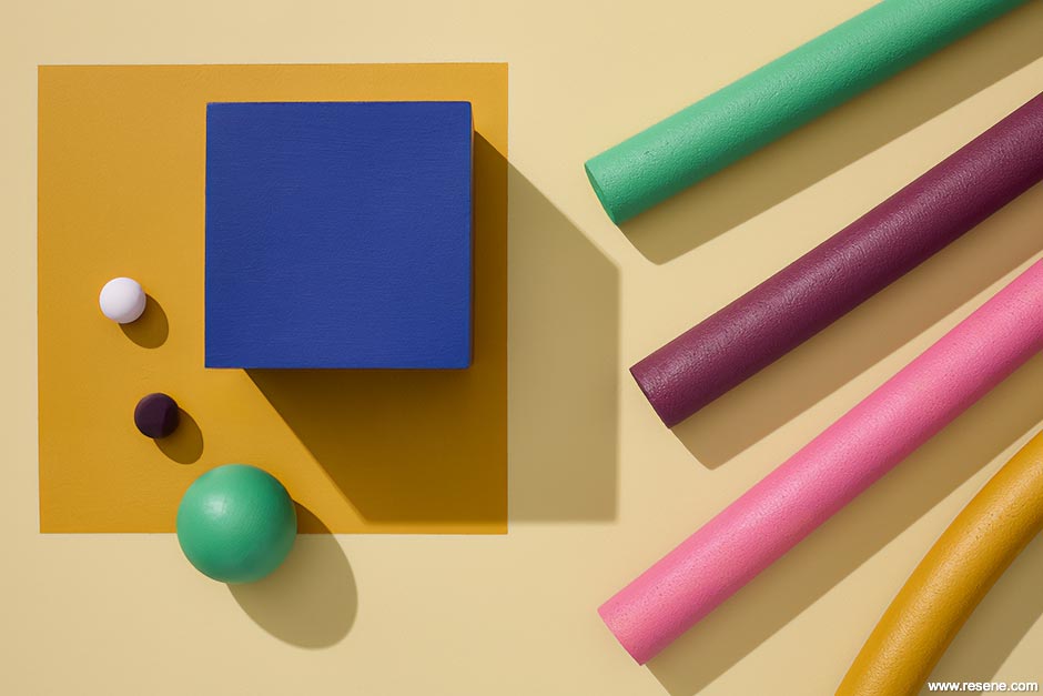
And while we thought the penchant for petal pinks might have fizzled out by now, it seems it will instead be reinvigorated with this push for positivity. Watch for paler shades like Resene Vanilla Ice and richer ones like Resene Rouge making a resurgence.
We’re sure that even those that don’t feel the same love for pinks that others do will agree that it’s high time for a rosy outlook.
Styling: Laura Lynn Johnston
Images: Bryce Carleton
This is a magazine created for the industry, by the industry and with the industry – and a publication like this is only possible because of New Zealand and Australia's remarkably talented and loyal Resene specifiers and users.
If you have a project finished in Resene paints, wood stains or coatings, whether it is strikingly colourful, beautifully tonal, a haven of natural stained and clear finishes, wonderfully unique or anything in between, we'd love to see it and have the opportunity to showcase it. Submit your projects online or email editor@blackwhitemag.com. You're welcome to share as many projects as you would like, whenever it suits. We look forward to seeing what you've been busy creating.
Earn CPD reading this magazine – If you're a specifier, earn ADNZ or NZRAB CPD points by reading BlackWhite magazine. Once you've read an issue request your CPD points via the CPD portal for ADNZ (for NZ architectural designers) or NZRAB (for NZ architects).
![]() Get inspired ! Subscribe
Get inspired ! Subscribe ![]() Get saving ! Apply for a DIY card
Get saving ! Apply for a DIY card
![]()
Can't find what you're looking for? Ask us!
Company profile | Terms | Privacy policy | Quality and environmental policy | Health and safety policy
Colours shown on this website are a representation only. Please refer to the actual paint or product sample. Resene colour charts, testpots and samples are available for ordering online. See measurements/conversions for more details on how electronic colour values are achieved.
What's new | Specifiers | Painters | DIYers | Artists | Kids | Sitemap | Home | TOP ⇧


