Blackwell and Sons: Emporium of Wonder
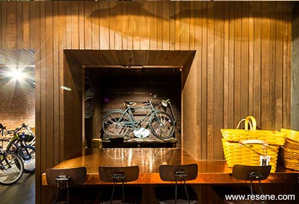
Dark tones and textured surfaces were selected to create a dramatic and atmospheric space that achieves a restored vintage workshop aesthetic.
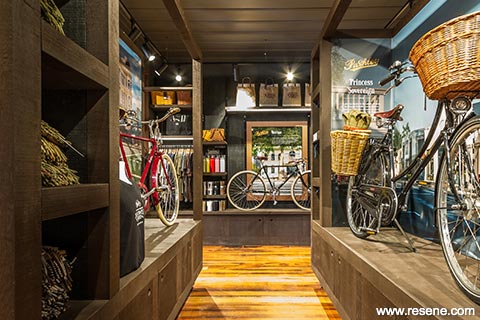
With the need to relocate and expand into a larger space, Blackwell and Sons – Cycling Lifestyle Merchants secured the iconic Greytown Borough Council Building, a Category 2 Historic Place built in 1878.
Blackwell and Sons approached Mackit Architecture with the vision to create a retail space completely and uniquely tailored to their requirements, “emulating the best retail experiences enjoyed in London, New York and San Francisco.” An industrial-style, restored workshop aesthetic was the intent; with relevance and attention paid to the handmade, traditional British bicycles that define the store. The space needed to exceed standard retail build/design quality, with the intention of becoming a sensory retail experience to exhibit a wide range of products in a gallery-style setting, while incorporating functional storage, a flexible display system, effective lighting, accessibility improvements and achieving commercial objectives.
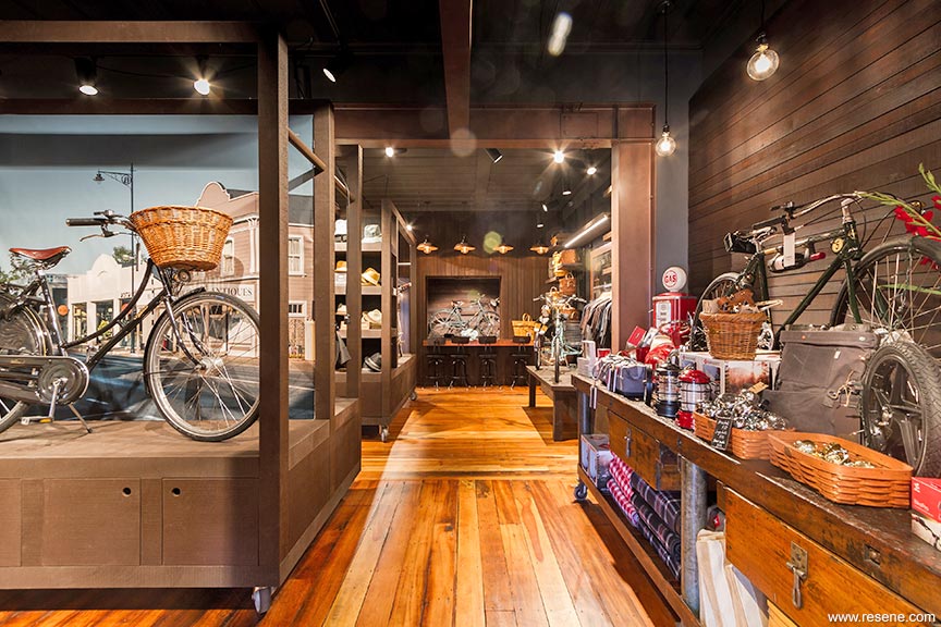
The existing space consisted of a series of small rooms formed over the course of various alterations. Poor remodelling from the 1980s heavily influenced the layout of the space, preventing the desired modern retail experience. This layout clashed with original features, such as the ornate staircase and board and batten ceiling, which were crucial components to retain for heritage purposes. It was initially obvious that the entire lower level of the building had to be reconfigured, alongside an extensive structural renovation, while taking care not to disturb the original features.
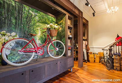
From a heritage perspective, the proposed design and the completed alterations needed to achieve a sense of the original 1800s interior. Steel portals subsequently outline where walls once stood creating relevant, defined spaces within the newly functional, open-plan store.
The aesthetic response to the brief, culminating in a dramatic and textural retail environment, was inspired by the original heritage building, the bicycles, and the sentiment of a vintage workshop. Band sawn timber is the dominant material of the space; in the form of plywood and varying width/depth panelling finished in multiple stain tones. Raw copper countertops alongside metallic painted steel portals provide a stark contrast to the rustic atmosphere formed by the timber. London style brick veneer furthers the textural experience while paying homage to the origin of the bicycles.
Heritage New Zealand requested that the original 1870s architectural layout, form, surfaces and materials of the building had to be visible or referenced if the existing unsympathetic alterations were to be removed and the building undergo renovations. The original board and batten ceiling, stairwell and building exterior also had to be retained and unaltered. Colour tones sympathetic to the building and referencing its era were preferred.
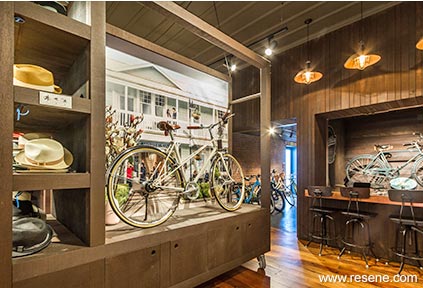
Variations in the tone, colour, materiality, lighting and finish of the space help to define areas of function and use. This is of particular importance when highlighting areas uncommonly found in a bicycle store, including the workshop and associated copper-clad bar. Dispersed throughout the store are three portable display units that house featured bicycles. 2.60m tall and constructed from band sawn cedar, they help to divide the space while maintaining its scale and aesthetic. Inbuilt shelving, lighting, replaceable background imagery and concealed storage make them highly functional. The moveable nature of the units and adjustable displays afford simple reconfiguration of the store layout.
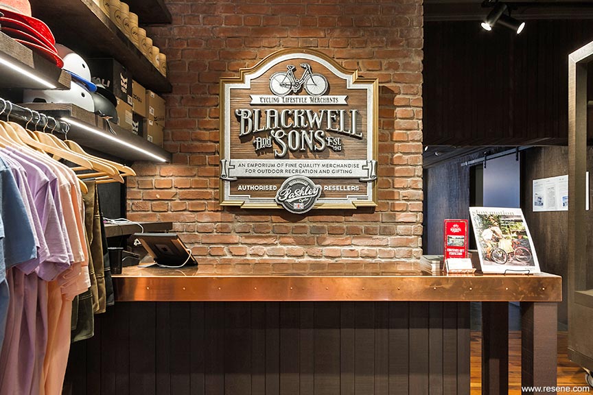
The design of the space successfully blends and balances elements of function, retail, exhibition, experience, tactility and atmosphere. Blackwell and Son’s ‘Emporium of Wonder’ isn’t limited by what a regular bicycle store ‘should be’.
Dark tones and textured surfaces were selected to create a dramatic and atmospheric space that achieves a restored vintage workshop aesthetic. Resene metallics were used to highlight certain features as a reference to the bicycles that define the store.
Resene Colorwood Bark (deep brown), applied to a variety of band sawn timbers (cedar, ashin and pine), is the dominant colour tone of the space. A warm, dark brown, it is used as a reference to stained and worn timbers that could be found in a vintage workshop. The band sawn texture that forms the majority of surfaces in the store interacts with the lighting to create a deep and shadowy surface, enhancing the moodiness of the dark stain tones. This timber tone contrasts with Resene Colorwood Dark Rimu (timber brown), a slightly lighter and warmer tone used to highlight particular areas such as the workshop and bar area. Selected areas were repainted in Resene custom matches to the original wall colour.
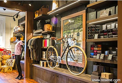
Resene Colorwood Pitch Black (tar black) is used as a background tone behind wall shelving, helping the feature Resene Colorwood Bark toned adjustable shelves, bicycles and products stand out.
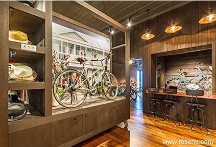
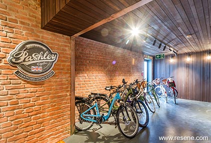
Resene Armadillo (armour grey) is used as the primary paint colour. Used in Resene Lumbersider low sheen waterborne paint in the main store area on the ceiling and walls, it further contributes to the moody and atmospheric tone of the space. Resene Armadillo is a striking deep and inky grey; it was chosen as a darker progression of Resene Stack (serious grey) and also for its warm undertones which complement the timber. It functions in a similar way to the Resene Colorwood Pitch Black plywood, helping the feature surfaces, products and colours to stand out. Resene Armadillo is also continued onto the rear floor in Resene Walk-on.
Keeping with the same heritage-derived colour family, Resene Double Stack (armour grey) is used in darker and more enclosed areas such as the toilet and overflow store space. When compared to Resene Armadillo, Resene Double Stack significantly lightens these smaller functional areas while maintaining the overall aesthetic.
Resene Copperhead (copper metallic) over Resene Black Magic (warm dark brown) is the feature colour tone, alongside raw copper surfaces. The metallic paint references the bicycles as well as highlighting the steel portals that outline where original 19th century walls once stood. After significant testing, the Resene Copperhead and Resene Black Magic combination was chosen as it struck the correct balance between brightness, tone and ‘aged’ look. Applying one thin coat of metallic over the base paint achieved the desired distressing without having to hand paint the surfaces, which would have impacted upon the tight construction timeline.
The concrete room to the rear of the building was added in the 1980s as a fireproof archive room. It wasn’t suitable as a retail space as it was cold, dark and uninviting; only accessible via a heavy metal vault-style door. To improve the space and make it suitable for retail use, two large steel reinforced openings were cut through the concrete block walls. After some transition remediation work on the Matai and concrete floors, this space was seamlessly integrated to form an important part of the overall store. It now houses a test ride area, workshop, accessible toilet, accessible rear entrance, overflow store space and garage access.
The redesigned store needed to comply with modern accessibility requirements. As the original building didn’t lend itself to being ‘accessible’ much work was put into achieving this. Colours, textures and surfaces were a major accessibility consideration.
This project won the Resene Total Colour Commercial Interior – Public + Retail Award. The judges said “a deceptively wide range of layered paint and stain colours seamlessly meld together different eras of building elements. The backdrop of dark colour thrusts the product forward but also speaks to its grunty industrial vibe and mechanic nature. Like entering a new world, the palette and product range is immersive from top to toe encouraging you to take your time and explore. An instant winner.”
Architectural specifier: Mackit Architecture
Building contractor: Holmes Construction Wairarapa
Client: Blackwell and Sons
Engineer: Sullivan Consulting
Painting contractor: Best Blokes Decorating Limited
Photographer: Marshall Pitney Photography
Timber: Herman Pacific
Winner: Resene Total Colour Commercial Interior – Public + Retail Award
Project: Resene Total Colour Awards 2019
From the Resene News – issue 1/20
Resene case studies/awards project gallery
View case studies that have used Resene products including many from our Resene Total Colour Awards. We hope these projects provide inspiration for decorating projects of your own... view projects
Total Colour Award winners:
2023 |
2022 |
2021 |
2020 |
2019 |
2018 |
2017 |
2016 |
2015 |
2014 |
2013 |
2012 |
2011 |
2010 |
Entry info
Latest projects | Project archive | Resene news archive | Colour chart archive