One Man’s Treasure, New Zealand Maritime Museum
A rich but refined colour palette was devised, then fully integrated with all aspects of the design.
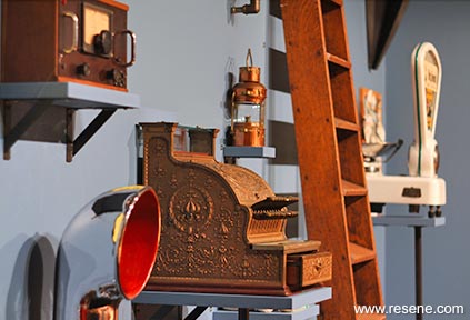
One Man’s Treasures: John Street and the Fosters Collection is an exhibition developed to celebrate John Street – a man with a passion for preserving New Zealand’s maritime heritage. The exhibit features objects that were originally part of the historic Foster’s Ship Chandlery.
So many who have experienced the original Chandlery over the years describe a kind of labyrinth of nautical curiosities with surprises around every corner. A key objective for the design team was to retain the eclectic character of the collection but also to guide visitors through the stories in the exhibition with a cohesive aesthetic.
Objects from the collection feature materials such as bronze, copper, rope, leather and wood all of which were tested under exhibition lighting alongside Resene drawdowns to determine which colours would best complement such a variety of textures. From there a rich but refined colour palette was devised, then fully integrated with all aspects of the design from lighting, exhibition graphics, audio visuals, interactive activities and marketing collateral.
The whole experience from seeing posters on the street through to interacting with the exhibits is bound together using colour.
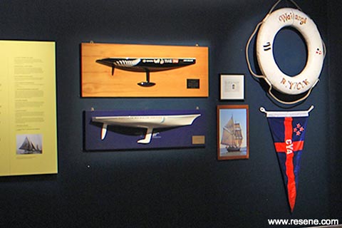
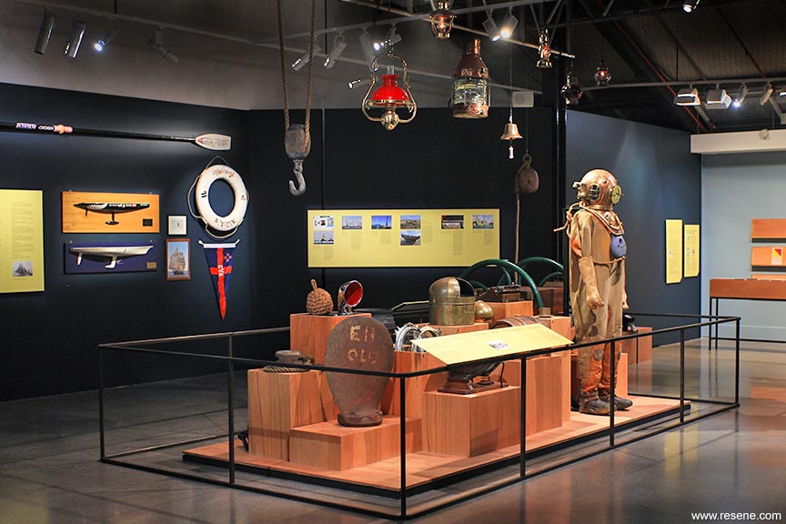
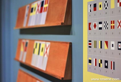
The gallery was by default a relatively open plan space however colour allowed the creation of discrete thematic sections in the exhibition. Resene Seachange (soft blue) helps to define and recreate a shop counter area. Resene Tangaroa (deep blue green) draws together the main gallery space along with graphic treatments in Resene Dolly (citrus yellow) which illuminate stories and give clarity to the narrative voice. Other graphic treatments are in Resene Del Toro (spirited red). Resene Bali Hai (moody blue) brings energy to the kids’ activity space where younger visitors can engage with hands on interactive activities and role playing. In the kids’ activity featuring signal flags traditional primary colours are substituted with equivalents from the exhibition palette and all the colours are expressed together using this captivating nautical language.
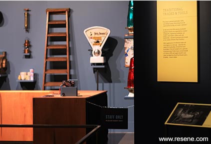
The original Fosters Chandlery was also described as a hybrid of shop meets museum, so the new exhibition furniture needed to respectfully present collection items, but also to allow them to resonate with some of the patina of the old shop. Plywood plinths and risers provided a warm counterpoint to the cooler paint colours and introduced the language of crates and nail boxes to the overall material language.
Resene Tangaroa was the perfect deep backdrop for the objects and supporting plinths which appear as if illuminated by the glow of hanging ship lanterns - an evocative setting to discover tales of a New Zealander infused with the spirit of the sea.
Resene Tangaroa initiates the visitor experience with typographic treatments in Resene Dolly contrasting and complementing the deep rich wall colour. Resene Seachange defines and outlines the retail space that works much like a set design but with collection objects on display playing the main role. Close attention has been given to the behaviour of Resene colours under exhibition lighting, taking into consideration how the colour relates to its surrounds in light, shade and everything in between. All the Resene colours selected for the exhibition carry their rich pigmented effect through the range of light conditions.
The gallery features hinged walls which have been used at 45- and 90-degree angles to create smaller spaces within the gallery. Transitions between these spaces are clearly defined with a change in wall colour. From the retail space Resene Seachange changes to Resene Tangaroa. Where the main gallery space is joined by an activity space for children it changes to Resene Bali Hai. This colour provides the right energetic complement to the plywood construction used for interactive elements.
Resene SpaceCote has come through as a very effective way to get colours to sing under these specialised lighting conditions. Coloured walls provide a supporting background to the rich objects assembled and it’s the flat nature of the Resene SpaceCote finish that fulfils this role particularly well.
The exhibition needed to feel as if it was presenting the collection of someone with their own personality and understanding of the maritime experience; something between an eccentric retail space and a museum. The colours provide the correct sense of nostalgia and create a dream space for visitors. Photographs of the old shipping chandlery provided important reference as to the juxtaposition of objects and feeling of spaces. Due to the partial demolition of the heritage building where the chandlery was housed, this exhibition has played an important commemorative role for many in the maritime community.
This project won the Resene Total Colour Installation – Experiential – Product Award. The judges said “immersive and moody, this complementary colour palette captures attention and draws visitors into the exhibition. The hues work to bring focus and a sense of continuity and storytelling to the collected pieces so they can take centre stage. The colours become part of the exhibition story woven into the theme. Colour brings this collection together.”
Client: NZ Maritime Museum
Colour selection: Nick Eagles, The Letter Q
Conservator: Rose Evans
Painting contractor: Rassmuss Whenuaroa
Other key contributor – display furniture: Artisan Builders
Other key contributor – lighting: Brian Mahoney
Other key contributor – mount making: Object Support
Other key contributor – printing: Big Colour Ltd
Other key contributor – set design: Jan Ubels
Other key contributor – video content: Ormiston Junior College
Photographer: Southern Studios, Nick Eagles
Winner: Resene Total Colour Installation – Experiential – Product Award
Project: Resene Total Colour Awards 2019
From the Resene News – issue 1/20
Resene case studies/awards project gallery
View case studies that have used Resene products including many from our Resene Total Colour Awards. We hope these projects provide inspiration for decorating projects of your own... view projects
Total Colour Award winners:
2023 |
2022 |
2021 |
2020 |
2019 |
2018 |
2017 |
2016 |
2015 |
2014 |
2013 |
2012 |
2011 |
2010 |
Entry info
Latest projects | Project archive | Resene news archive | Colour chart archive
![]()
![]() Get inspired ! Subscribe
Get inspired ! Subscribe ![]() Get saving ! Apply for a DIY card
Get saving ! Apply for a DIY card
![]()
Can't find what you're looking for? Ask us!
Company profile | Terms | Privacy policy | Quality and environmental policy | Health and safety policy
Colours shown on this website are a representation only. Please refer to the actual paint or product sample. Resene colour charts, testpots and samples are available for ordering online. See measurements/conversions for more details on how electronic colour values are achieved.
What's new | Specifiers | Painters | DIYers | Artists | Kids | Sitemap | Home | TOP ⇧


