A Foray into Play
Glorifying colour to evoke specific ‘moods’ for the space - was a target for this design process.
In New Zealand, there are numerous initiatives as to how we build in the landscape. On one hand, giant engineered infrastructures knit together a chaotic playground of mountainous slopes for skiers. Meanwhile, conservation efforts in the forests have motivated constructions to inflict minimal impact on the natural environment.
Buildings in the bush have, in the past, defaulted to ‘natural’ or minimal colour palettes. The architecture of the bush in New Zealand has moved away from a relationship with colour, the contemporary ruling rejecting playful colour. The ideology of colour ‘range’ favours quietness, and disappearance into the background of nature.
This thesis proposes a way that architecture could rekindle a strong, playful relationship between culture and the bush of Aotearoa. The project uses an analogue media process to explore the use of traditional watercolour painting techniques, and the role of colour in the space of the bush to discover a language of play in the forest. The process develops a system of structures that intimately understands the trees, the birds and the spirit of the land.
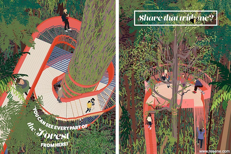
Aptly named ‘A Foray into Play’ the focus is on a playground where visitors can play in our most revered natural landscape. Seven pavilions emerge to form an adventure in the bush: arranging new opportunities for visitors to play with the forest on Kapiti Island.
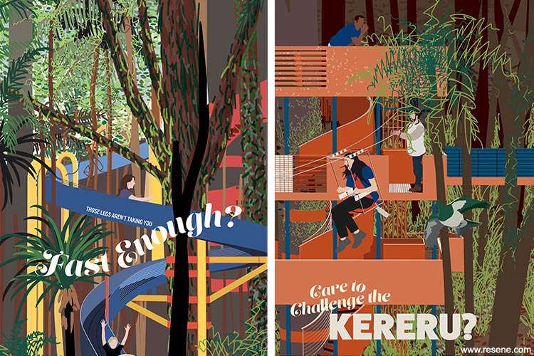
The project is then represented through the medium of tourist illustration with posters bursting with a bright palette and worshipping the idea of a new vision for the bush.
The palette of the playground is a general assembly of a palette with specific hues, responding to the green of the bush. With green dominating the palette, the pavilions form a team of the supporting actors and complete the range of colours.
Resisting the common trope of ‘associative colours’ - glorifying colour to evoke specific ‘moods’ for the space - was a target for this design process. There’s multiple streams of research on this aspect of colour, thousands of books written explaining why yellow is ‘happy’ or purple introduces a feeling of focus. This research aimed to discover how the playground could draw attention to the beauty of the forest as a living, energetic place.
Resene colours are often the base of the New Zealand architectural palette, and offer a thoughtful collection of colours that work with the landscape of New Zealand. The playground, developed through painting process, extracted an understanding of how important colour and form is to visualise the play of architecture, how ‘whimsical’ building in the forest might evoke a conversation as to how narrow our ‘ecotourist’ solutions have become.
The palette started with green, specifically, Resene Bush (traditional green) and Resene Kaitoke Green (bold green), the sisters of Kapiti Island’s green forest, and was built from there using a collection of creamy yellows, dusty pinks and oranges, and muted reds and blues. In all, these Resene tones were brought together to the playground - Resene Bright Spark (hot yellow), Resene Hero (knocked back orange), Resene Sunshade (fun orange), Resene Red Hot (primary red), Resene Glorious (clear pink orange), Resene Rapture (hot orange pink), Resene St Tropaz (bright blue), Resene Azure (cornflower blue), Resene Cobalt (cool blue), Resene Havelock Blue (summer blue), Resene Cioccolato (deep brown), Resene Kaitoke Green and Resene Bush.
The playground, like any ‘inspiring’ type of building, needed a strong image to amplify the concept of ‘play of colours’ as the material of the playground. To include every colour in a controlled collection of colours meant that the design might draw attention to the presence of the very colour itself, and perhaps, a rebellion against the lack of colour seen in contemporary architecture in the New Zealand forest.
The palette was made to be pushed to the limit to be considered ‘playful’, and be of a school of thought that really understood the colours of New Zealand, while being mindful of the lighting and natural colours that the bush has evolved over time.
The palette hasn’t changed from the start, but the uses of it have changed. Initially, they started as tools to paint the landscape of play on Kapiti Island. This evolved to matching colours to form, to understand their response in architectural mass.
The project won the Resene Total Colour Rising Star Award. The judges said “this colour treatment is a fresh take on colour use in nature. Brave and celebrating the structure in colour, there are no camouflage colours here. Playful yet respectful, the colour palette is sympathetic to natural greens using a pop of bold colours that can be found in floral brights. The colour and structure lifts you off the forest floor.”
Architectural specifier: Elise Cautley
Winner: Resene Total Colour Rising Star Award
Project: Resene Total Colour Awards 2018
From the Resene News – issue 4/2018
Resene case studies/awards project gallery
View case studies that have used Resene products including many from our Resene Total Colour Awards. We hope these projects provide inspiration for decorating projects of your own... view projects
Total Colour Award winners:
2023 |
2022 |
2021 |
2020 |
2019 |
2018 |
2017 |
2016 |
2015 |
2014 |
2013 |
2012 |
2011 |
2010 |
Entry info
Latest projects | Project archive | Resene news archive | Colour chart archive
![]()
![]() Get inspired ! Subscribe
Get inspired ! Subscribe ![]() Get saving ! Apply for a DIY card
Get saving ! Apply for a DIY card
![]()
Can't find what you're looking for? Ask us!
Company profile | Terms | Privacy policy | Quality and environmental policy | Health and safety policy
Colours shown on this website are a representation only. Please refer to the actual paint or product sample. Resene colour charts, testpots and samples are available for ordering online. See measurements/conversions for more details on how electronic colour values are achieved.
What's new | Specifiers | Painters | DIYers | Artists | Kids | Sitemap | Home | TOP ⇧


