Architect's memo 100: September 2010
In February of 2007 I wrote (what I considered to be) an erudite memo (No. 86) describing colour space, how it worked and how the new (then) Resene colour coding exploited this system. Unfortunately it appears the clarity of my prose was evident mainly to myself and many were still left floundering in a coloured hazy maze. Mea Culpa, mea culpa!
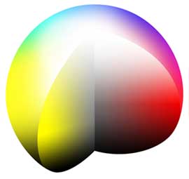
It is understandable, with colour charts being presented on two dimensional sheets, that it could be assumed that colour space was also two dimensional whereas this is not the case. Colour space is a three dimensional world through which one can move in any direction. Moving through this space, any colour (red for example) can be bluer or yellower; darker or lighter; greyer or brighter.
Acknowledging the limitations of the above description and the fact that a picture is worth a thousand words, we have included an image of colour space. We will also include this image in our electronic version of Memo 86 which should then make things much more understandable.
Another area which frustrates our clients is our inability to exactly match colours from given RGB values.
The method that RGB uses to achieve colour is diametrically opposite to the methods paint manufacturers use. The RGB system is ‘additive’ in nature, that is, it emits light in three primary colours. Colours are achieved by ‘blending’ different amounts and intensities of these colours. When all three of these colours are ‘blended’ at equal levels (RGB 255 255 255), white results.
Each pixel on a screen contains the three (red, green, blue) phosphors packed so closely together that the eye is tricked into thinking it is one colour source. Primary colours are presented using only one of the phosphors while secondary colours are produced by using two. Hence secondary colours are invariably brighter than primaries.
RGB colours are always presented on a screen and the colour perceived is strongly affected by the quality and type of screen. A visit to any television retailer will quickly confirm the above.
Paint manufacturers, on the other hand, use coloured pigments to achieve colour which are ’subtractive’ in nature. They rely on outside light sources impinging onto them; absorbing (subtracting) most of the wavelengths and only reflecting the desired wavelengths, that is red light in the case of red pigments etc.
Secondary colours, made by blending two primary pigments, are always duller than their parent primaries as they absorb even more light. As Monet found, a blend of all the primaries produces black.
Add in the fact that the pigments available to the paint industry do not have the purity of the light sources used in RGB, and one can see how the difficulties of producing exact matches mount.
If you have an RGB colour on your screen that pleases you, print it off. If the print still pleases you, it’s a fair bet that your local Resene ColorShop will be able to give you an acceptable match to it.
The ‘subtractive’ nature of paint colours leads to another annoyance. As writ above, red pigments appear red because they reflect the red wavelengths in the incident light and absorb the rest. However, if there are no red wavelengths present in the incident light (in a blue light for example), our brilliant red pigments will simply appear black.
This rather extreme case serves to highlight the role of the light source on the appearance of paint colours. Bright and shaded daylight, tungsten filament, sodium or mercury vapour, fluorescent lighting all have different spectral compositions and interact differently with colours. A change in colour as seen under different lighting conditions is called metamerism.
There are many routes to produce any selected colour and many similar pigments that can be used. It is therefore highly unlikely that the same colour produced from two different sources will have exactly the same spectral composition. Typically a match to a selected colour is done under one set of lighting conditions and significant variations can occur under others.
A major source of annoyance is when using colour cards printed with inks, which are metameric with paints. For that reason Resene have been using Resene SpaceCote Low Sheen to produce colour cards, using the same pigments used to produce the actual paints. This helpfully clears up one area of potential colour confusion so what you see is what you get.
Download as a pdf. (You will need Acrobat Reader).
Architects memos
The Resene architect's memo section provides technical information on a variety of topics relating to paints, finishes and coatings.
![]() Get inspired ! Subscribe
Get inspired ! Subscribe ![]() Get saving ! Apply for a DIY card
Get saving ! Apply for a DIY card
![]()
Can't find what you're looking for? Ask us!
Company profile | Terms | Privacy policy | Quality and environmental policy | Health and safety policy
Colours shown on this website are a representation only. Please refer to the actual paint or product sample. Resene colour charts, testpots and samples are available for ordering online. See measurements/conversions for more details on how electronic colour values are achieved.
What's new | Specifiers | Painters | DIYers | Artists | Kids | Sitemap | Home | TOP ⇧

