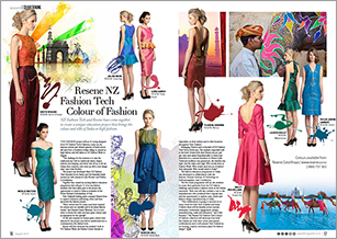
View fashion colour palettes from Apparel magazine combining the latest fashion from the catwalk with paint colours from Resene.
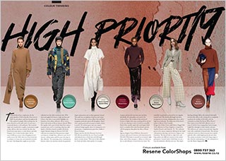 |
High priority Turtlenecks have been a staple piece for the cooler months of Fall for decades. First worn in 1860’s by polo players and then throughout the 19th century by people of the working class. At times referred to as the ‘polo neck’, it's now more commonly known as the turtleneck. This wardrobe staple soon transferred to equally a womenswear staple as they add not only extra warmth, but also class... more |
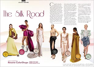 |
The Silk Road Camila and Marc’s Spring 2020 collection saw a colour palette of trendy spring colours as well as minimal black, white and neutral tones. This collection was varied with flowing dresses and skirts, boxy collared playsuits, as well as a few appearances of bishop sleeves. Every piece told its own story. The full-length mustard yellow dress couldn’t help but glisten in the lights. With its high neckline, full-length sleeves and to-the-floor skirt, this piece has the maximum amount of surface area to reflect and capture light showcasing the gorgeous yellow hue... more |
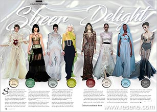 |
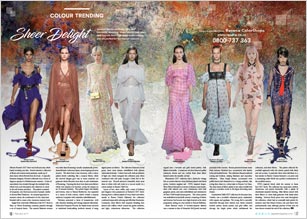
Sheer delight Sheer and see-through fabrics were at the forefront of fashion in the eighteenth century in Europe as seen in neoclassical gowns. Nude and skintone hued sheer fabrics in particular coined the name ‘illusion’ as they perceived to showcase more skin than appropriate in its era. Despite its booming popularity in the eighteenth century, you can trace sheer fabrics as far back as 3000BC when Saris made from silks with intricate embroidery were commonplace in Ancient Indian dress and culture. Semi-transparent textiles are commonly created from mesh, web, net, knit, and lace, and were the top textiles seen in the Fall season of the couture world... more |
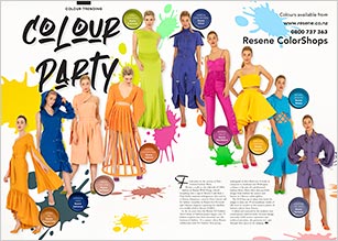 |
Colour party Crafted and nuanced by the students into contemporary fashion looks, intricate design rationales, bold creative expression and technical precision, the garments were put through their paces at the judging... more |
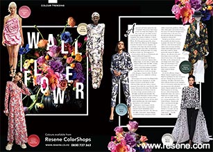 |
Wall flower Aganovich and Taylor explored the idea of anxieties “from society, from being a woman, for loving other designers,” and that to reach your own thing, you have to go through them. This collection was heavily inspired by The Anxiety of Influence: A Theory of Poetry, the 1973 book by literary critic Harold Bloom. All of the garments graced the runway with an I and A-line silhouette, the duo designers found the fine balance between simplicity and complexity of the design, they did this through clean tailoring and creative fabric manipulations... more |
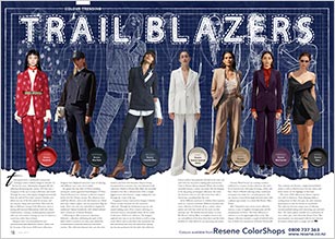 |
Trail blazers Through the years, tailoring has changed dramatically from the style of Yves Saint Laurent’s Smokers suit; which was one of the first made for women, and was timeless, sharp and form-fitted. Then with the likes of Hellesey’s trompe l’oeil silhouettes, there is suiting with textured fabrications, bold rich colour combinations, creating a modern glamour approach with ease and comfort. Suiting can now be styled in a casual way rather than a formal... more |
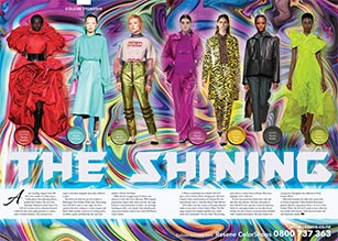 |
The shining As seen at Paris Fashion Week, this Fall 2019 ready-to-wear collection was packed with feminine looks that were loud, chic and ultimately relaxed... more |
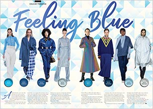 |
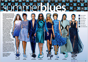
Feeling blue A shade doomed to never date, blue is having a yet another moment. As one of the most versatile hues second to black, varieties of blues are bound to cross your path at one point or another. Here are our top blue moments from Fall 2019... more |
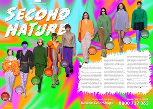 |
Second nature Dries Van Noten opened their Fall 2019 RTW show in Paris with a sea of black garments. Light shades of purple were slowly introduced, followed by a soft yellow and mint. As the looks became more playful, bold orange accents in a shade close to Resene Daredevil elevated the collection... more |
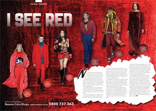 |
I see red In the fashion world, red is a bold showstopper. It captures attention and never goes out of style... more |
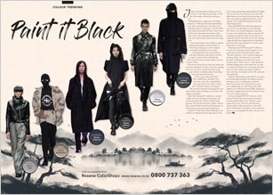 |
Paint it black Colloquially known as ‘goth ninja’, this fashion movement is a dark spin-off of avant-garde fashion, a style with a monochromatic colour palette and minimalist aesthetic. It first began in the late 2000’s when fashion houses like Raf Simons, Rick Owens, and Givenchy all incorporated elements of the style on the runway, draping top-heavy black and grey robes, leather jackets and scarves with strange cuts... more |
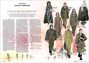
| Less function, more utility Utility fashion is about highlighting elements of practical clothing and taking it to the extreme. It’s the epitome of form versus function, as both are maximised and brought to the front of attention. Historically, utility clothing was first produced to help the British military efforts and aid the economy during the second world war. Cloth, wool, and leather were all in short supply, as were clothes makers, as much of the skilled labour force had left to fight... more |
|
| On the fringe The seventies have been known to be the ugly duckling decade in the fashion world. The era of “anti-fashion” and “bad taste” has not held back world-class designers and fashion houses from re-inventing timeless trends. The revival of one of the decade’s most notable trends “the fringe” has hit the runways again this season and is demonstrating dominance once again... more |
|
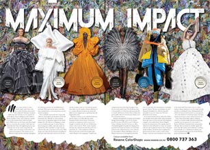 |
Maximum impact More is more and less is a bore, said Iris Apfel. Galia Lahav took those words of wisdom and turned it into a silhouette with layers of pleated chiffon that only reminds you of an episode out of My Big Fat Gypsy wedding. In a hue similar to Resene Gumboot, Lahav used a multitone material to create this maximal impact off-the-shoulder gown. With a sheer cut-out bodice and elbow length gloves to accessorise the ensemble, Galia Lahav has nailed the brief... more |
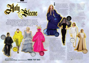 |
Holy sleeve Bishop sleeves have been used intermittently since the 6th century. Popular in the romantic 30s and hippie 60s, designers Dame Mary Quant and Andre Courreges gave new life to the historic puffy sleeve and created something that would continually reinvent itself. You can be sure that you’ll find an adapted version of the bishop sleeve in nearly every woman’s closet. Unlike when the trend first came about 15 centuries ago, today we see loose draped sleeves with the tight-fitting cuff... more |
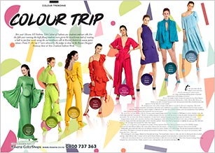 |
Colour trip This year’s Resene NZ Fashion Tech Colour of Fashion saw students embrace silk. For the fifth year running the high-flying students were given the treacherous task of creating a look in just four weeks using the extraordinary silk in Resene’s hottest in season paint colours. From 35, the top 17 were selected by the judges to show at the Resene Designer Runway show at New Zealand Fashion Week... more |
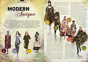 |
Modern antique Antique and vintage clothes are making a prominent comeback this year. Florals, sequins and renaissance prints were all spotted walking the runways. A staple for every fashionista, you would be hard-pressed to find a wardrobe that doesn’t have a vintage floral skirt, shirt or dress hanging in it. Originating from Asia, floral patterns have long reigned supreme in the fashion world... more |
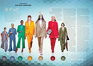 |
If it suits However, it wasn’t until the 1900’s, that women started adopting the comfortable collaboration... more |
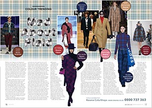 |
Mad about plaid Plaid has come a long way since being banned from Britain in the 1700’s because of its association with the Scottish Rebellion. The crisscross pattern, made famous by punks, grunge and nineties movies such as Clueless and Dukes of Hazzard, has seen another resurgence this year thanks to designers like Stella McCartney and Marc Jacobs... more |
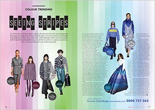 |
Seeing stripes Is a Zebra white with black stripes or black with white lines? It is the existential question that plagues the playground. Socrates himself couldn’t answer this question (even though he probably had no idea what a zebra was). 2018’s fall fashion shows saw the emergence of the hotly debated fashionable stripe, as it did the rise of the ever so famous tartan twopiece, and oversized faux fur coats smothering models... more |
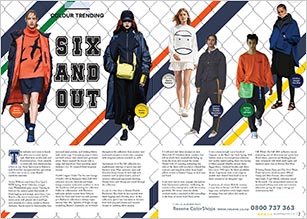 |
Six and out The industry can’t seem to knock its addiction to casual sporty style filled with comfortable and functional pieces. From catwalks to streetstyle, luxe altheisurewear is here to stay. From Sportsmax to Raeburn, each brand has incorporated luxe sportswear on their own terms to create flexible wardrobe essentials... more |
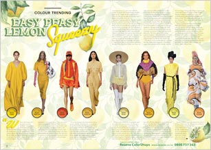 |
Easy peasy lemon squeezy Whoever said orange is the new pink is seriously disturbed,” claimed Reese Witherspoon in Legally Blonde circa 2001. For approximately sixteen years, this remained true – but the Spring/Summer 2018 runways offered irrefutable proof that citrus hues as the new Millennial Pink are finally upon us. Across a multitude of shows, the contents of a fruit bowl provided designers with endless colour inspiration…more |
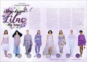 |
How do you lilac me now? Lorde has almost single-handedly launched lilac as the trend du jour. How? Take a glance at her Instagram, and you’ll find a string of lilac outfits befitting her Melodrama tour. At the same time, social media has begun influencing fashion trends, and zesty hues and unexpected colour combinations are firmly trending - due to their eye-catching Instagram appeal. These trend-making effects have combined, the beautiful shade crept into runway shows and is poised to take hold of the mass market this summer and later in 2018... more |
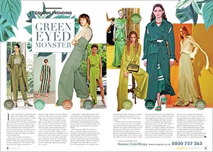 |
Green eyed monster If Alexa Chung and Miuccia Prada vacationed together in Los Angeles and then designed a collection based on their experience - Vivetta’s aesthetic would be the result. Steeped in trends, the Cruise 2018 collection was a mod fashion girl’s fantasy, with statement pieces galore and an effervescent selection of colours. Gingham, puffed sleeves, embroidered patches and kitten heels all piled in on top of each other - the epitome of extra. Combined with candy-fresh tones… more |
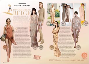 |
50 shades of beige Diversity in fashion has long been an issue – from the predominantly white industry to the concept of a ‘nude’ colour. Let’s not call it ‘nude’ anymore. Let’s call it beige instead. St John’s 2018 Cruise Collection is exactly what we imagine the Duchess of Cambridge would wear on a Sunday afternoon to have a glass of chardonnay at home with the girls. Relaxed and tasteful, the collection has soft pinkish hues and beige similar to Resene Alpaca… more |
 |
Dad’s day-off Designers sent ‘tourist dad’-inspired looks down the runway, heralding next season’s ode to practicality and function in a tropical environment. Fashion’s age-old fascination with ugliness has reached new heights in recent seasons, with ironic normcore giant Vetements blurring the lines between high fashion and everyday utilitarianism, and scores of other designers jumping on the trend. In contrast to the general ‘dad dressing’ trend which celebrates the banality of life, tourist dad is unashamed escapism - perhaps a reaction to the current climate of political, social and environmental instability… more |
 |
Trench (Coat) Warfare Fashion is known for poaching aesthetic inspiration from a wide variety of sources, but throughout modern couture is there any influence which has come around as many times, in as many different variations, as the military look? There’s something about a crisply cut trench coat and a statement pocket which captures designers’ imaginations. A.P.C oscillated between decades, but kept to a neutral colour palette… more |
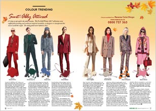 |
Suit-ably attired It’s time to suit up for the cooler seasons. Bonjour Hermès. The Pre-Fall/Winter 2017 collection is 1970’s Paris in a nutshell, with softly feminine silhouettes and a nonchalant air. The colour palette comprised of muted tones and deep rich hues perfect for a morning walk along the Seine… more |
 |
Fur fox’s sake These candy coloured confections are eyecatching and modern. MaxMara’s Pre-Fall/Winter 2017 collection had a distinct ice queen feel, with stark white tones dominating the first half of the show. While the clothing had a classic, ladylike feel, the slicked back hairstyling and dramatic black lipstick gave the collection a fresh look… more |
 |
Sheer delight A typically feminine designer, Ferretti’s collection was a vision of elegance apropos to Mediterranean summer. A hint of masculinity was revealed through the multiple belts, which were used throughout the collection to cinch in the soft dresses and skirts. The palette consisted of turquoise, red, black and accents of purple, similar to Resene Blue Diamond. An unusual approach to summer colour, the combination of rich, deep hues blended well to create a fine, luxurious summer look… more |
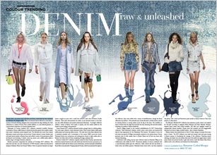 |
Denim raw & unleashed Denim’s fresh, new-season look is all about raw hems, a trend that has been embraced by celebrities and designers alike. While raw hemmed denim debuted on jean hems, a myriad of forward-thinking designers have incorporated the edgy detailing into their collections in a variety of forms, from a subtle addition, to a neat tailored garment, to a pronounced component of a heavily distressed item... more |
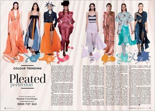 |
Pleated perfection Peruse any street-style picture gallery from the past year, and you will inevitably spot a pleated midi skirt. The style shot to fashion-blog fame when Alessandro Michele featured a gold lamé pleated midi in his debut for Gucci, and it has remained a style-staple. This collection was a departure from Saab’s usual ethereal ball-gowns and featured bright, all-over prints with stars. One of the most refined gowns in the collection was a soft, metallic peach hue. The metallic fabric, similar in colour to Resene Guggenheim, caught the light and the delicately angled pleats reflected a luminous glow… more |
 |
Shine bright What do Leonardo da Vinci, King Tut and Michael Jackson all have in common? Sequins. Three key elements of the sequin’s history lies among these three icons. For instance, somewhere between 1480 and 1482, da Vinci made a couple drawings to build a machine that would, like a hole punch, cut small disks from a sheet of metal. Despite this, the machine was never made and therefore we do not know if his purpose was for business or pleasure. Before da Vinci, there was Tutankhamun... more |
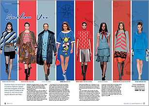 |
Sailor vie In fashion, history is on repeat season in season out. References replayed and trends reimagined. In this cycle nautical references washed out the runways in a tidal wave of sailor inspired silhouettes and colours… more |
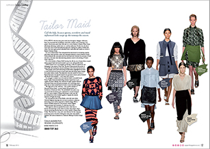 |
Tailor made Call the help, because aprons, overskirts and maid influenced looks swept up the runway this season. Following with the army green trend seen throughout designer collections, Peter Som harnessed the housekeeper trend with a simple touch of layering. Som paired a floral screen print dress with skirt in a colour similar to Resene Chalet Green effortlessly delivering a stylish twist on a uniform silhouette. Further into the show... more |
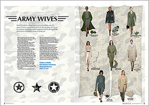 |
Army wives |
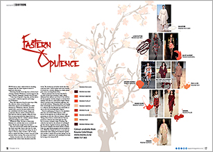 |
Eastern opulence From luscious reds to delicate kimono detailing, designers take the Orient Express in search of inspiration this season. Following Danielle Scutts departure as former head of design, Matthew Williamson took the reigns for his latest collection, designing it himself, from the heart. “I have been doing this a long time, and the trick is to not make a collection repetitive and boring,” said Williamson. Maroon, similar to Resene Persian Red, held the collection together, telling the story... more |
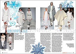 |
Snowflake With spring on the doorstep, designers look ahead to create the upcoming trends for next winter. It’s no secret black has become the standard choice in colder months – until now. Runways were treated to a dusting of white this season, with various designers opting for a fresher palette to combat the expected dull, wet and depressing winter selection of black, navy and charcoal. Not to be confused with spring collections, the choices this season still feature many furs and jackets, doing away with a darker palette for a modern alternative in bone, white, enamel and much more... more |
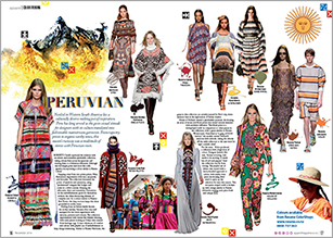 |
Peruvian Nestled in western South America lies a culturally diverse melting pot of inspiration. Peru has long served as the go-to visual stimuli for designers with its culture translated into fashionable mainstream garments. Roberto Cavalli captivated the audience with an eclectic and somewhat psychedelic collection, taking colours from across the spectrum and treating them to a bohemian silhouette... more |
 |
Resene NZ Fashion Tech Colour of Fashion |
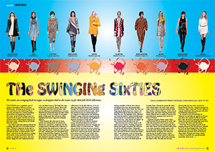 |
The swinging sixties The sixties were a significant time of change in the fashion industry, as Anna Wintour says, “growing up in London in the ‘60s, you’d have to have had Irving Penn’s sack over your head not to know something extraordinary was happening in fashion”. The iconic era has become a huge source of inspiration for designers and this year was no exception with several designers bringing out their inner mods... more |
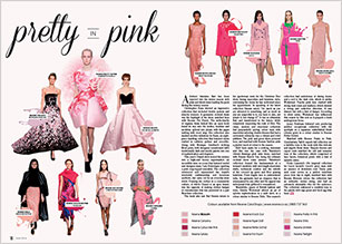 |
Pretty in pink A distinct feminine flair has been injected into the winter season with pink and blush tones leading the pack during the runway season. Christopher Kane showed an impressive collection that included double jackets and slouchy trousers. A geometric cocktail dress was the highlight of the show, matched here with Resene Pot Pourri. The mille-feuille of organza dress looked like an open book found its way onto the bodice, hemline and neckline, spliced into pleats, with the pages wafting with every step... more |
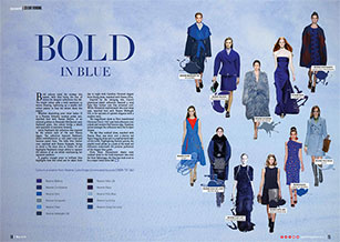 |
Bold in blue Bold colours ruled the runway this season, with blue being the hue of choice for designer collections this fall. The bright colour adds a bold statement to winter dressing, lightening up a usually dull colour palette to beat the winter blues this season. From Mary Katrantzou’s classic navy cocktail dress to the bold statement two-tone fur from Balenciaga, the blue hue look is set to be a major trend come fall... more |
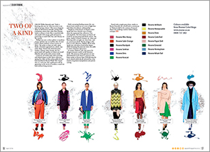 |
Two of a kind Orson Welles famously said, “Style is knowing who you are, what you want to say, and not giving a damn.” This season designers adopt an adventurous attitude, pairing bold, contrasting colours that rather than clashing, work to enhance a look. Blue is matched with red, purple with orange, gold and maroon, partnering to exude fresh, fun, and vibrancy on the runway... more |
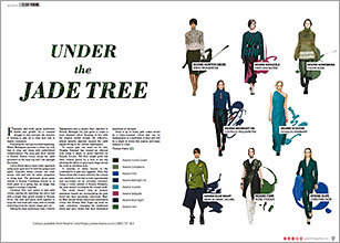 |
Under the jade tree Fantastic and fresh, green symbolises health and growth. In a constant struggle to stay relevant, the industry is looking to jade for a crisp new look to dazzle consumers. A surprise to many buyers is the combination of jade and eggplant. Dries Van Noten shows that if used correctly, the colours can establish a look that is both experimental and successful for an everyday customer. Dress it up or down, jade comes across as a trans-seasonal colour that can be manipulated in a multitude of ways and will be a staple in stores this season, and many seasons to come… more |
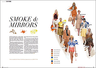 |
Smoke & mirrors Sultry and seductive like a romantic Parisian street, the fashion collective are chewing tobacco and spitting out the palette for this seasons colour trends. Hints of gold, cognac, chocolate plus indigo weave together to achieve a diverse and modern selection of colours, keeping it fresh and fun. As each colour influences the other, designers take what would appear as a dull choice and transform it into a palette that is compatible across many inspirations, backgrounds and visions – a creative feat not to go unnoticed… more |
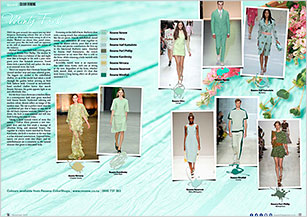 |
Minty fresh Pass the gum around; this season sees top label designers showcasing colours that are a breath of fresh air. Mint comes back strong in all of its shades. Washed out almost blue, pastel mixes, and pure green like the herb itself are apparent as the chill of peppermint coats the palette of the industry. Incredibly varied, mint is an experience that takes many forms, each one as strong as the next. Regardless of the form, whether bold, muted, dark, or pastel. It’s clear that mint leaves a long lasting effect… more |
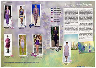 |
Lavender farm The industry is abuzz with word that lavender is in. Vast fields of luscious purple are the inspiration for the latest trend in colour this season. Designers keep the colour pure, with little to no embellishment, opting to play with tone and fabric rather than crowding the silhouette with unnecessary detailing. Nature again serves as an excellent focal point for inspiration, but what makes it something beautiful is the imagination and talent of creative designers around the world. Although they all start at the same point, the end result is never as one would have expected... more |
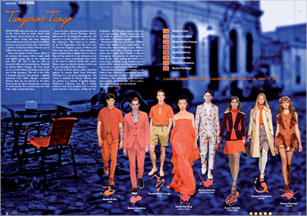 |
Tangerine tango Designers take a bite into the sweet juices of this winter fruit as trends dictate bold and vibrant colour choices for the upcoming season. Sweet orange and tangy tangerine saturate fabrics across the runway, from chiffon gowns to custom print suits - this season holds a palette of delicious fashion flavours set to titillate the senses of the industry. Natural things stand the test of time, so it's evident that tangerine is appropriate across a broad spectrum of historic and futuristic influences... more |
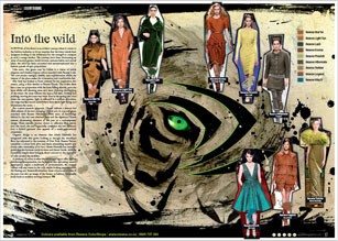 |
Into the wild Survival of the fittest is an evident concept when it comes to the fashion industry, so it's no surprise that the latest trends have designers looking to the wilderness for the strength to compete in such a savage market. The runways have been showcasing an array of natural greens, burnt browns, autumn leaves and crystal lakes, the wild has been cocooned and metamorphosed into a fashion parade of epic proportions. A plethora of colour is what the wilderness has to offer, and an interesting interpretation can be seen in this upcoming season. Appropriate across a multitude of environments, the natural colours will stay warm in the cold, whilst looking appropriate in the blaring sun. Essentially timeless, these colours are a vision of the past, but also an image of the future, as fashion continually looks back to redefine moving forward... more |
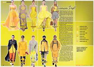 |
Lemon zest Colour therapy tells us that yellow is about confidence, a key trait when it comes to fashion. With that in mind, fashion trends are making lemonade out of 'Lemon Zest' this season, parading juicy yellow goodness for the fashion industry and quench the need for such a bright and opulent colour. Like a ray of sunshine shining down the catwalk similar to Resene Wild Thing, the dress blows up like a jellyfish, reminding us of the summer beach without the sting. Although done in such a bright colour... more |
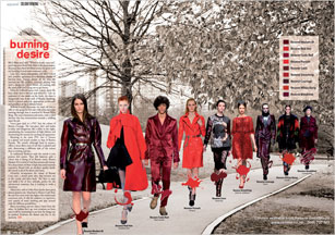 |
Burning desire Runways have been set ablaze across the globe with red burning its way onto everyone’s radar. Lust, love, desire and passion, red takes a stand and scorches audiences in a decadent display of luscious tone. Intense almost all the time, the runways are like wildfire, everyone playing with such a dangerous colour choice, all cooking with the same chilli and trying not to get burnt. As fashion fires up, new creations are born and it will be interesting to see how far things can be pushed. Embrace the flames and live for the moment… more |
 |
Oxidised From destruction comes this season's latest looks. The colours of corrosion eat away at the competition and come out victorious in browns, greens, golds and blues. Earthy tones and metallic shines mix elements of new and old into an incredibly organic trend that grows faster than rust on the bottom of a car... more |
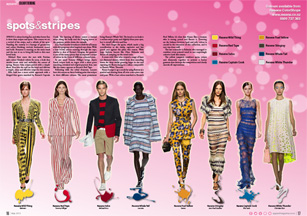 |
Spots and stripes Spring is about having fun and what better fun is there than stripes and spots. This season we see a revival of the stripe, and a rebirth of the spot. Parading the runway is a barrage of geometrics and colour blocking, vertical, horizontal, round and bold. Everyone is running on the same track and the race is on to bring life back to this once loved look... more |
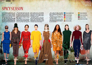 |
Spicy season An exotic adventure of grand couture, a new flavour, a new taste. The Spices of the souk can change a look into an ethnic parade of glamorous natural hues. From turmeric to cinnamon, cayenne to cardamom, the Middle East has it covered with colour trends coming from the hyper natural spices found at a souk... more |
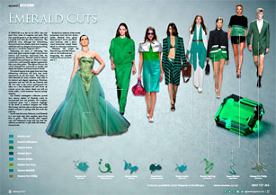 |
Emerald cuts A change is in the air for 2013, after last year’s fiery tones of tangerine and pink. This year emerald green is on the fashion cards and a popular hue with the SS14 collections. The jewel-rich tone, although less intimidating than previous year’s shades, there is no stopping celebrities and top designers from incorporating the hue as a wardrobe staple for 2013. Enhancing our sense of well-being, this vivid, leafy green inspires insight and promotes balance and harmony. Associated with the precious gemstones, Emerald could be defined as sophisticated and luxurious… more |
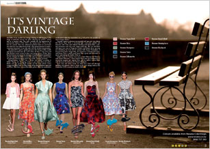 |
It's vintage darling Hailing from another era, vintage clothing is still hanging in the wings of wardrobes around the globe reflecting the politics, culture and art of another time. This year's catwalks saw the regeneration of retrospective fashion of the 1950s, the "perma-trend" is here to stay. But rest assured, these retro influenced garments have not seen better days and have been adapted with fresh, crisp spring/summers in mind, a convenient alternative to an older style with the modern interpretation. Of late, there has also been an increase in the awareness of environmental sustainability that has changed the habits of many by reducing, reusing and recycling old garments and revamping them into stylish, on trend... more |
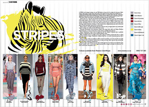 |
Stripes A zebra can’t change its stripes you say? Well fashion can’t get rid of its stripes for the season. Black stripes, white stripes, purple stripes, blue stripes. Every shade and every fabric from safe Breton’s to complicated feminine palettes and fine lines. Stripes have sat on the fine line between fashion dilemma and fashion success. Vertical stripes make people appear taller; however if you are already tall could potentially make you look like Lurch. Horizontal stripes just make you feel wider or associate you to Waldo, Sesame Street or an inmate. Resembling more of a clown look, wide horizontal striped socks should be avoided when choosing striped accessories. Sticking to a thin striped colour complementary pair such as black and grey or brown and khaki, will put you in good stead… more |
 |
Summer blues Blue is the hot new colour this season with hues ranging from stark cobalt to crepuscular shades. The great thing about any blue is that it complements any skin tone, so you don't need to go to Hawaii for a holiday before wearing it. Although better suited to black than navy, blues can be paired with neutrals or bright block shades. Metallic acts as the best counter colour, especially to the bright blues. Seen at Burberry Prorsum, iconic British luxury brand since 1856, incorporating both metallic and the blue into their renowned trench coat, bringing the classic beige trench up to par... more |
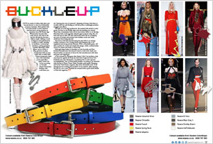 |
Buckle up |
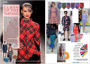 |
Clash of the tartans They say that in life you will never be further than six metres from a spider, and they also say that in London you will never be more than ten metres from a rat. These days it seems you will never be more than twenty metres from a plaid or tartan shirt. Farmers wearing them to work, teeny-boppers wearing them with belts cinched at the waist teamed with leggings, it is a well known fact that the tartan trend will never go out of style. Minimum fashion thought for maximum colour and pattern injections into your wardrobe... more |
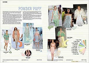 |
Powder puff For Spring/Summer 2013, the colour spectrum couldn't be at further ends from one another. On one side of the coin there is the in-your-face neon brights and on the other, a colour, much more lightweight, subtle and sweet - pastels. Ever-present colour blocking trends have taken a sharp turn into the shades of pastel. When it comes to putting together a pastel outfit, hues of mint green, cotton candy pink and daffodil yellows 'spring' to mind... more |
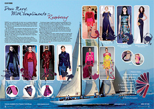 |
Dear Navy, with compliments - Raspberry Rarely seen as unfashionable, the classic navy is a wardrobe resident that adds crisp, clean lines and understated chic. According to Pauline Western Thomas's article "Navy and White Nautical Fashion Trends" from Fashionera, "dark navy has an authoritarian look which instantly marks the wearer out as well-groomed". Sky blue, baby blue, navy, ask anyone what their favourite colour is and a clear majority will say blue, so there is no doubting that the hue is no longer semi-permanent. Lending itself perfectly to the nautical trend in the guise of stripes, navy is the exotic sibling to the traditional black... more |
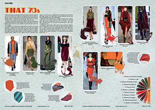 |
That 70s The last time fashion saw Bordeaux and Bottle together in the same collection was back in the early 70s. Earthy tones of garnet, ruby and rust reflects an autumn in Europe, whilst the deep sea and lush Amazonian greens echo soft calming elements. Burgundy red and burnt orange colours offer a native and natural quality contrasting with the rich verdant textures of the bottle greens. Gucci and Burberry have both been seen to literally 'tone-down' the pop colours we saw in spring... more |
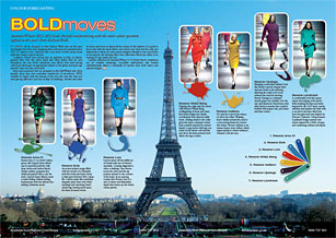 |
Bold moves Autumn/Winter 2012-2013 looks cheerful and promising with the entire colour spectrum. Almost every collection had a vast array of bold colours from pink and orange to green and red. Confident colours were turned into an epidemic in Paris in March, granted there were the classic black and white shades that are seen throughout the year. Heavy upholstery type fabrics were used among collections which gave an appropriate balance to the glitter and space-age metallic's that were also showcased... more |
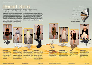 |
Desert sand Cool tones of ghost whites, mixed with nut-browns and a splash of colour are resounding colour palettes. The impact of colour can be seen in several forms of colour associations, where colour can be seen as either a symbol or a sign. While China's colour of good luck is red, red is also used to communicate visually, for example stop signs are red. Neutral tones and cream hues with the additive of black create feelings of sophisticated glamour with hints of simplicity and earthiness, leaving the cold winter at the door. Black is back for yet another season, I know, I know, "how cutting edge", you say? But these sleek creations with pops of cobalt blues and stark reds who could be bored this winter?... more |
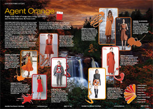 |
Agent orange Bright, bold shades of orange inject energy and vitality into Pre-Fall collections. Designers take note: the Pantone Colour Institute, the global authority on colour, has named the reddish-orange hue Tangerine Tango its colour of the year for 2012. The vivacious shade, described by Pantone executive director Leatrice Eiseman as “hopeful and optimistic”, takes the crown from 2011’s Honeysuckle, a sweet, flirtatious pink. The company has long aligned its colour of the year with the zeitgeist, and 2012’s pick is no exception: Tangerine Tango was chosen to provide “the energy boost we need to recharge and move forward” from recent troubling times... more |
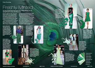 |
Freshly minted An array of peppermint hues spread their cooling influence over the Spring/Summer runways. Resurrection, regeneration, renewal - with so many positive connotations, it's no wonder that green is a standout colour for spring. Spring/Summer 2012's must-have green is a continuation of the sorbet hues that have been dominating the runways in recent months. The new season's peppermint hues are cool, fresh and appear in a range of intensities. From a barely-there minted cream... more |
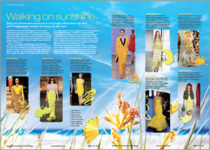 |
Walking on sunshine Spring 2012 collections burst onto the scene in a riot of bright sunbeam shades, with cheery yellows bringing warmth and light to the runways. From creamy vanilla shades to socket-searing citrus, yellow featured strongly in dozens of northern hemisphere designers' ranges in both blocks of colour and floral prints. "Florals - for spring? How groundbreaking," sneered acidic editor Miranda Priestley in 2006 film The Devil Wears Prada. But these weren't your ordinary florals: Rodarte's Van Gogh-inspired sunflowers were moody and ethereal, while Proenza Schouler's amber-and-orange renditions were slightly retro-inspired... more |
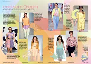 |
Icecream dream A swirl of sorbet hues makes its mark on Spring 2012 collections. Breezy pastels strike a note for spring, with cool icecream colours spread generously. Tart yellow, lollipop pink and creamy peach were designer favourites, complemented by cool blue and mint shades which were light and bright, but never clinical. The look had all the traditional trappings of femininity. Sherbet-tinged organza and chiffon added to the weightless feel for collections that were the height of springtime leisure... more |
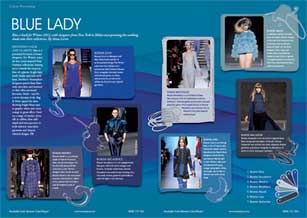 |
Blue lady Blue is back for Winter 2012, with designers from New York to Milan incorporating the soothing shade into their collections. Denoting calm and clarity, blue is a perennial favourite of many designers. For Winter tones are less ocean-inspired than Summer collections, leaning more towards the crisp ice blue of a glacier, bright lapis lazuli shades and rich royal hues. Northern Hemisphere designers paired deep blues with chocolate and mustard or that other perennial favourite, black - and for a more dynamic look, bright blues next to graphic white and citrus orange to great effect... more |
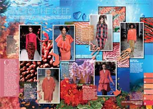 |
Hail to the reef The warm, fresh pinks and oranges of a coral reef suggest a tropical holiday, full of sun and sand. Coral gemstones are said to have healing qualities, enhance feelings of calm and ward off fears and tensions. In many cultures coral is worn as a talisman to protect the wearer against evil spirits. Northern hemisphere designers have harnessed the uplifting powers of coral... more |
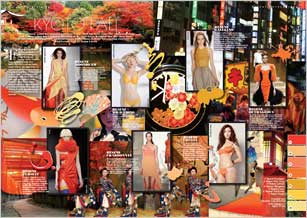 |
Kyoto fall The Japanese word for autumn leaves is 'koyo', and for next year the vibrant orange and yellows that have tourists flocking to Kyoto's koyo hotspots are the same hues brightening up designers' autumn/winter collections. Energetic reds and browns, warm, vivacious hues continue to make their mark. The trend is toward cheery poppy yellows, the zingy scarlet of Japanese maple leaves, and oranges ranging in tone from creamy peach to fire-bright... more |
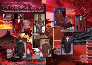 |
Red storm rising Nature in revolt and chaos is a splendid, blood-pumping spectacle and menswear for autumn/winter 2012 gets an injection of heat and vitality, with shades of red from crimson to mahogany making their mark next season. Red is a hue that packs a walloping punch – associated with blood, fire and revolution, it’s a look that’s not for the fainthearted. Eye-catching and majestic, red is a colour that denotes power and prestige... more |
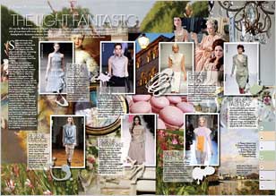 |
The light fantastic It's not the Marie Antoinette of history, but more of Sophia Coppola's cinematic feast that captures the spirit and zest of a woman who was larger than life and of a fashion palette that lives on. Powdery pales dust the northern hemisphere's Autumn runways, bringing tenderness and tranquillity to crisp tailoring and luxe fabrics. Subtle and serene, icing sugar tints make their appearance for next year's rainy season, injecting cold, blustery days with sweetness and whimsy. Smatterings of lilac and peach, dove grey and tea green infiltrate. From misty green to mushroom pink, these ethereal hues lend a soft pop of light to a variety of fabrics for a look that certainly doesn't pale in comparison... more |
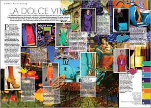 |
La Dolce Vita La Dolce Vita (1960) was shot in black and white, but everyone knows that when you close your eyes, a Fellini universe burns with the electricity and vibrancy of an eternal Italian autumn. The sweet, hedonistic and romantic spirit of that age lives on, evoked by the season’s palette of acid yellows, turquoise and frenetic orange hues. Passionate, full-bodied colours make a strong impact for next autumn, with Northern Hemisphere collections showcasing a hearty mixture of blues, greens, pinks, yellows and oranges. The message seems to be that the bolder, the better – think retina-searing bursts of citrus, bright pops of aquamarine and sensual, opulent purple… more |
 |
The Orient excess An oriental colour palette consisting of a pre-requisite scarlet red is set to turn heads next season, enhanced by jade greens and mandarin tinged yellows. Harnessing the exotic and mystique of the East, designers such Jack McCullough and Lazaro Hernandez of Proenza Schouler cleverly mixed ethnic inspired prints with textural elements, reinforced by a strong colour palette of bold red, mandarin yellow and deep turquoise. Ralph Lauren’s ode to the orient… more |
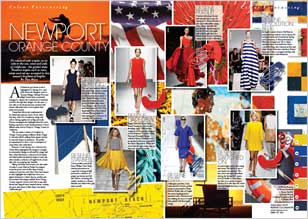 |
Newport Orange County |
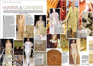 |
Hunters and gatherers Mother Nature inspires for Summer 2011/2012 with a dusky palette inspired by all things natural from clay browns to gold wheat tones. An extension from this summer’s obviously organic palette of beige, nude, light olive and white, next summer will highlight tea stained tones and flaxen coloured fabrics for a look that’s time worn and timeless. Earthy neutrals make a subtle and serene statement signifying a colour palette inspired by untreated and undyed fabrics and textures. The moral of the story here is the more organic looking the better... more |
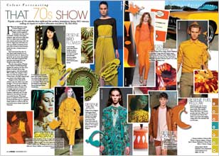 |
That 70s show Popular colours of 70s suburbia have infiltrated the northern hemispheres Spring 2011 runways, making an impact on modern silhouettes and fabrics. From the distinctive orange of classic Penguin book covers to kitsch German and Belgian ceramics peppered in unusual tones, key colours of pistachio, mustard, cactus green, marigold, taupe and brown made their way on to almost every household item, artwork and furniture of the 60s and 70s. Tupperware and fondue sets came in a myriad of castaway colours and coffee coloured wooden furniture framed the décor of many homes of the time… more |
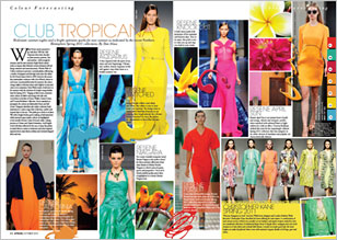 |
Club Tropicana Hedonistic summer nights and a bright optimism sparks for next summer as indicated by the recent Northern Hemisphere Spring 2011 collections. Wham! Pretty much summed it up with their 1983 hit Club Tropicana when they describe an ideal summer getaway: Fun and sunshine - there's enough for everyone, and for next summer, bright block colours make an impact after fashion's current obsession with all things minimal and monochromatic... more |
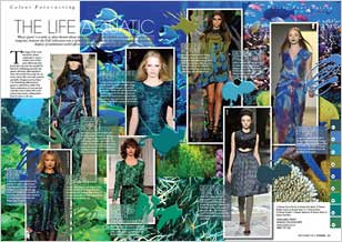 |
The life aquatic |
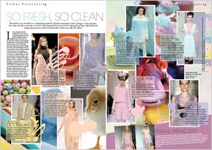 |
So fresh, so clean The 2010 season heralded in a minimalist wardrobe. Popular minimalist colours of beige, cream and grey also make way for a new take on ‘clean’ with designs that are pared back and pastel, giving a refreshing and invigorating boost to winter’s traditionally somber tones… more |
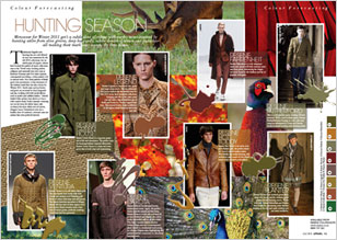 |
Hunting season Menswear for Winter 2011 gets a subtle dose of colour with earthy tones inspired by hunting attire from olive greens, deep burgundy, subtle shades of brown and pistachio - all making their mark next season. Traditional English style hunting has not only filtered its way into menswear for the fall 2010 collections, but its subtle pops of organic colours have formed the palette of many collections seen so far... more |
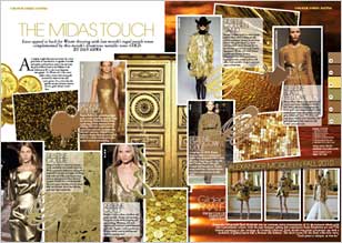 |
The Midas touch Luxe appeal is back. As a highly sought after precious metal, the colour gold needs no introduction. A signifier of wealth and quality, gold has been used in the arts from the gold artifacts found in the Balkans in the 4th millennium BC to the iconic Egyptian hieroglyphs. For Winter 2011 the colour makes a fierce return with tonal golds accented by warm browns and rustic greens. It’s a colour that also signifies success, because everyone knows gold always comes first... more |
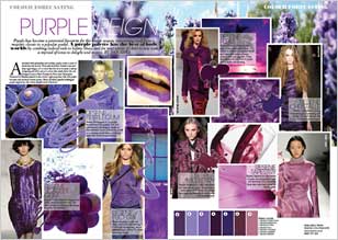 |
Purple reign Purple has become a perennial favourite for the winter season, reinventing itself from a majestic classic to a popular pastel. A purple palette has the best of both worlds by combing radical reds to balmy blues, and for next winter it’s here to stay with a myriad of tones to delight and inspire… more |
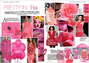 |
Pretty in pink |
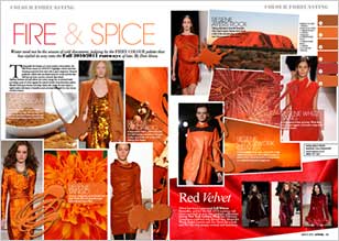 |
Fire and spice Winter need not be the season of cold discontent, judging by the fiery colour palette that has sizzled its way onto the Fall runways of late. Traditionally the domain of a more somber colour palette, this season highlights colours that have warming properties from salsa reds to spicy tangerines. Bronzed goddesses collide with sun kissed sirens for a look and feel that will heat up those concrete coloured days ahead… more |
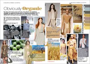 |
Obviously organic The Spring runways were awash with a new lease on modern, elegant and understated dressing aided by a refreshing and simplified colour palette of limpid colours that aer semi-transparent and iridescent. Let’s herald in the new decade with a clean slate. Easy, light and luminous, the new spring pastels take their cues from monochromatic tones and natural palettes… more |
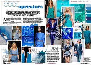 |
Cool operators A summer favorite, evoking clear summers skies and aquatic adventures, Spring is set to highlight the blues palette as a strong feature next Spring Summer. The beauty of blue tones is that it reflects heat and is a visually appealing colour for those hot summer months. The feeling is cool, dominated by blues with additions of pale greens and soft putty hues for a complete look. Blues are softened and diluted, moving away from strong nautical influenced shades to hues reflecting the freshwater aquatic.… more |
![]() Get inspired ! Subscribe
Get inspired ! Subscribe ![]() Get saving ! Apply for a DIY card
Get saving ! Apply for a DIY card
![]()
Can't find what you're looking for? Ask us!
Company profile | Terms | Privacy policy | Quality and environmental policy | Health and safety policy
Colours shown on this website are a representation only. Please refer to the actual paint or product sample. Resene colour charts, testpots and samples are available for ordering online. See measurements/conversions for more details on how electronic colour values are achieved.
What's new | Specifiers | Painters | DIYers | Artists | Kids | Sitemap | Home | TOP ⇧

